

Bonsai UI | feature request: promote Grouping and Filtering to main menu

Before writing an issue with a feature request I thought it'd be better to see if anyone likes or dislikes the idea of adding a new icon promoting Grouping and Filtering to the top tier, something like

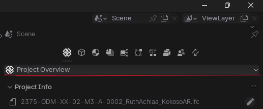
I personally find a bit inconvenient the current location at the very bottom of Project Overview to perform common tasks like grouping, search and filtering elements
any thought? thanks anyway


 and 1 other.
Comments
No objections? ;)
OK #5857 posted
cheers
I'll be honest, I wasn't a fan of your proposal, but I'm new around so wasn't sure if I should speak up.
The nature of IFC means the interface is complex and "deep". The danger I see with your solution is that it is repeated, and you just end up moving a problem from one area of the UI to another. More and more tabs, and the new ones will be comparatively empty. In another application I maintained for a while I had to resist constant requests to add yet another menu item. If I hadn't I would have ended up with a context menu as tall as the screen! UI is truly a tricky balancing act.
I think there's an argument to be made for making the panel more prominent under the project tab. Maybe have it located between Spatial and Project Setup. For me the Spatial and Grouping & Filtering tabs are the most constantly used ones in this tab, so they should be prominent. The others seem to be more "set and forget", or occasional use only. Of course others with more knowledge/experience have better thought through opinions than mine.
Just my 2 cents worth.
@sjb007
thanks for your input
I'd be happy to have it relocated there, deal :)
Exactly what I meant, in my point of view we need to differenciate submenus that are only once, or rarely accessed at all, from those part of daily workflow
for me all inputs are equally important, often times best ideas come from 'out of the box', glad I had yours
cheers
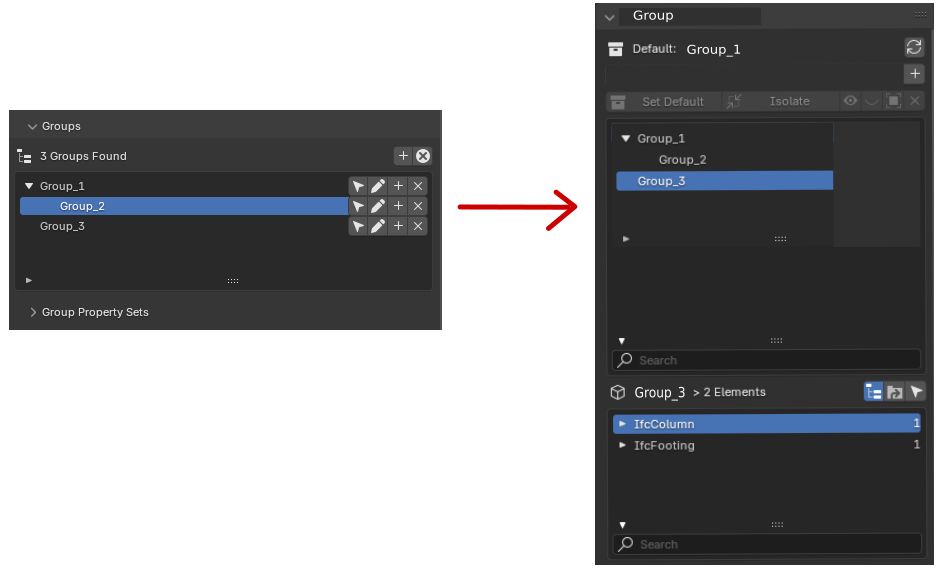
In another post I had suggested changing the groups interface to something similar to the "Spatial Decomposition" interface, to maintain a standardized UI.
Hi all.
I request we freeze the Bonsai main menu for an improved user experience (UI/ UX).
Anytime one scrolls down and wants to switch to another menu you have to scroll up again to switch to a different menu.
The user experience is not convenient for me especially when it becomes repetitive.
Freezing the main menu so that it doesn't have to scroll with the whole panel will help avoid scrolling back to the top to switch to another menu.
Thank you.
@Owura_qu it's not possible AFAIK, but you can customize the interface with something like that
I also think that grouping/filtering is a major area of interest/use. As soon as the model grows, the need to have fast grouping/filtering mechanisms becomes a must. I like the proposal from @steverugi . I also think that the outliner serves that type of purpose. In my case what I do is to split the outliner part (which does not require so much space since it has not so much "grouping" as in FreeCAD trees) since basically I use the search rather than sliding up and down. I add the "project overview" and move the panels of spatial & Grouping and Filtering to the top. So in the left side of the screen I have most of my tools to select/filter.
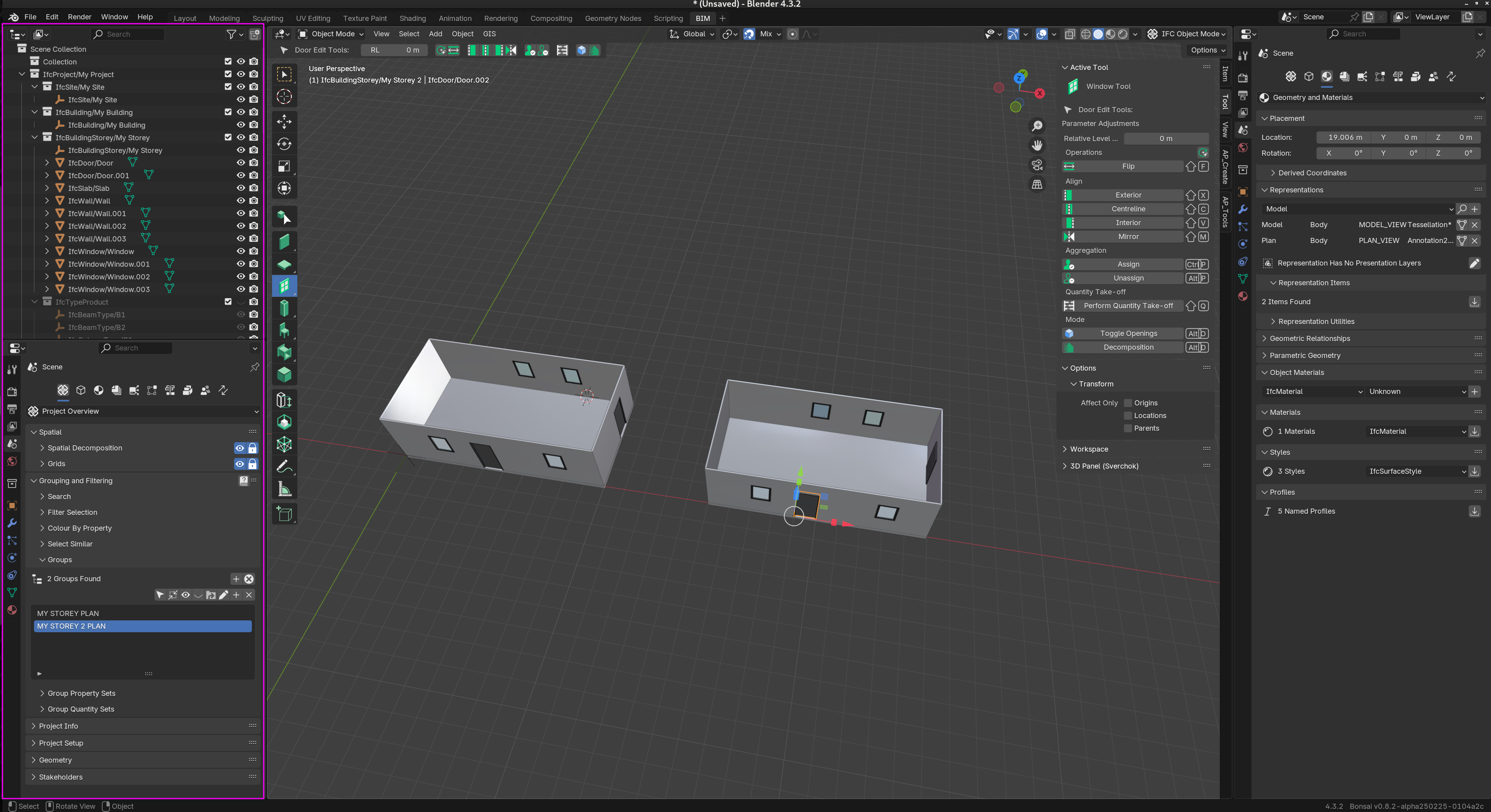
Someting like this:
It's unfortunate but I will go with your trick:). Thank you.
EDIT: I tried the trick but switching on the new small panel doesn't switch on the main working panel, not working sadly.
@Owura_qu hehe you're very right. Sorry for the false hope :)
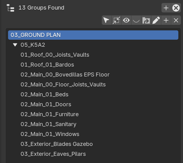
In order to improve the usability of the Groups panel I have added a pull request to sort them by group.name.
Update operator.py so groups are sorted by group.name #6311
Example: When adding a prefix with a number to the groupname, you get is ordered for easy access:
Thanks!