

Suggestion for a more modern osarch.org page style

Can I suggest a more modern osarch.org webpage tyle?
I think the colors and style are not good. The paragraph diagram does not emphasizes the main statement.
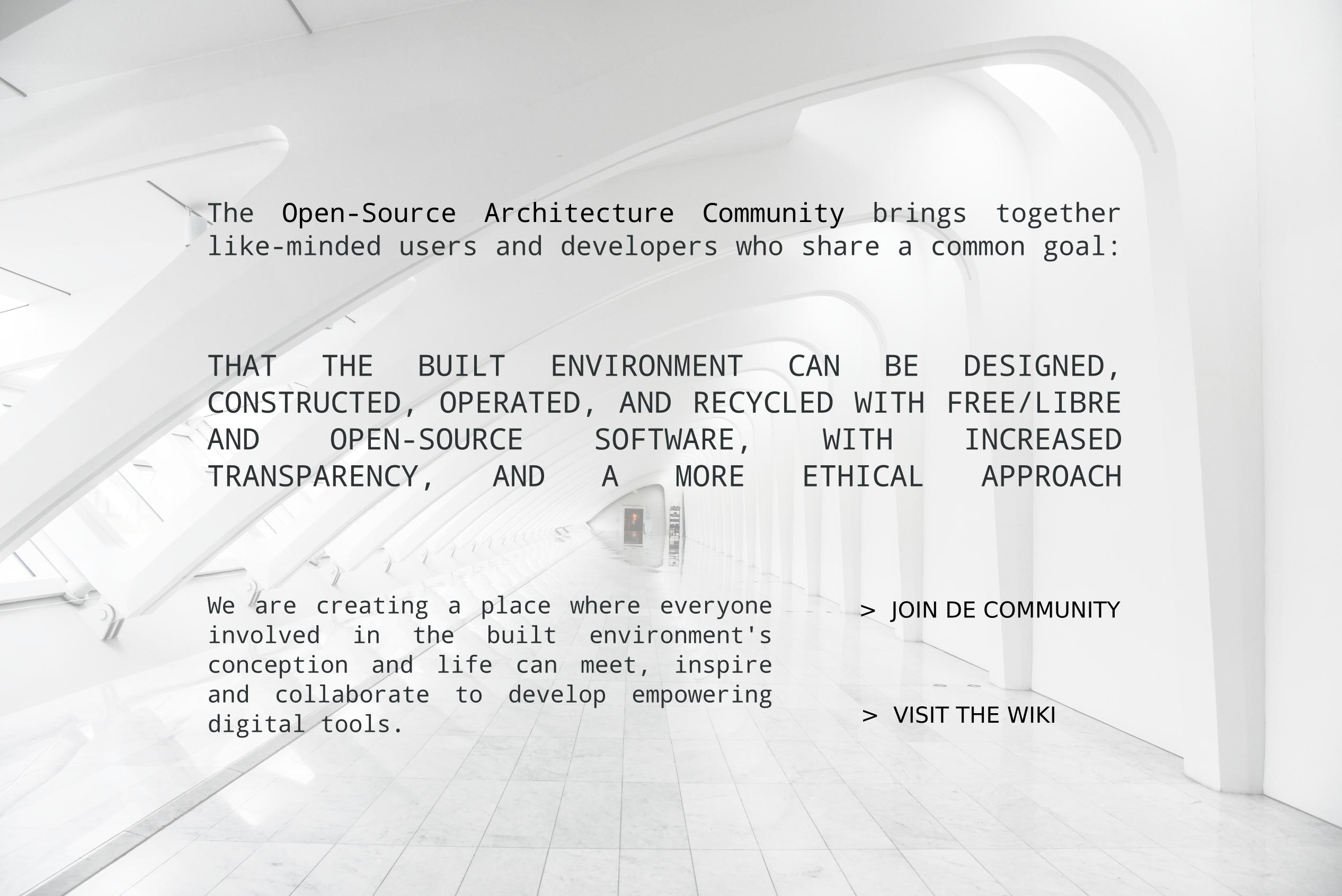
If it is possible, it would be nice to improve the design of this page. Here I show an idea about what can be done. Maybe someone have a better design to suggest.
Tagged:
Comments
looks good, what do you say @Moult ?
Added the "wiki" tag https://community.osarch.org/discussions/tagged/wiki
osarch.org is the landing page for this project. From this page people should get the main message and the options to proceed to the more valuable content like tools, forums, or documentation.
@bitacovir very happy to get an improved homepage! It'd also be super cool if the background was a changing slideshow of cool OSArch imagery. What is the picture you've shown? Is it related to OSArch somehow and do we have the rights to use it?
So long as people are happy with the change, I'm also happy to deploy it.
The image is only an example. You can use another. But I got it from https://www.pexels.com/ that it is free to use.
I think your idea of osarch images as background is cool. I suggest to have always a nice contrast with the text. White image if it is possible. Or dark with white text. Therefore, filters can be use on the background.
I am sharing other examples with the idea of osarch images as background or as pictures. The files are attached. The typo font is Noto Mono.