Well TBH the second and last examples don't look like they work the way they should ? Intuitively I would say lower left corner. I would maybe also prefer the line to extend below the text to its rightmost character
The center option's alignment doesn't look quite right. I think the arrow should align horizontally with the pointy bit of the curly braces - but maybe this is just a screen display issue.
Also, the label description says "Text box alignment" but it does not seem to consider the whole text box, just the first line of a multi-lined Literal value.
@tim said:
The center option's alignment doesn't look quite right. I think the arrow should align horizontally with the pointy bit of the curly braces - but maybe this is just a screen display issue.
The curly braces are replaced. It looks like the line is aligning to the top of a lowercase non-ascending character. It would have been easier to judge if it had some typical text values in there.
Whether linked data labels are used or not, shouldn’t the alignment (top, bottom, center) be based on the full extent of the text box, rather than just the first line?
Here’s a screenshot showing how the current options work in the column on the left, compared to my expected output, which I think follows the label description more accurately "Text box alignment", in the column on the right.
@tim The top alignment is "ok" in deliberately small letters ;-)
Your two examples leave the issue of separating multiple multi-line boxes (I'm looking at some of the drawings by @theoryshaw here which have many bits of text :-). I think the line should go to the first line so my eye knows intuitively where to start reading. Aesthetically, the middle left one looks nicest of the alignments to my eye. However... not an architect, so my opinion is maybe less valid.
I think there are different use cases for top line positioned leaders and true middle text box positioned leaders. For technical drawings I would agree with your preference, but for more design intent focused drawings I can see the use case for wanting the leader to start from the actual middle . What has got me stumped is why the left-bottom is so popular. Could someone shed some light on the use case for bottom-left?
Possibly more useful options would be something like this:


Comments
Well TBH the second and last examples don't look like they work the way they should ? Intuitively I would say lower left corner. I would maybe also prefer the line to extend below the text to its rightmost character
The center option's alignment doesn't look quite right. I think the arrow should align horizontally with the pointy bit of the curly braces - but maybe this is just a screen display issue.
Also, the label description says "Text box alignment" but it does not seem to consider the whole text box, just the first line of a multi-lined Literal value.
The curly braces are replaced. It looks like the line is aligning to the top of a lowercase non-ascending character. It would have been easier to judge if it had some typical text values in there.
Whether linked data labels are used or not, shouldn’t the alignment (top, bottom, center) be based on the full extent of the text box, rather than just the first line?
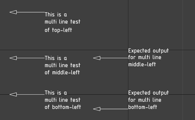
Here’s a screenshot showing how the current options work in the column on the left, compared to my expected output, which I think follows the label description more accurately "Text box alignment", in the column on the right.
@tim The top alignment is "ok" in deliberately small letters ;-)
Your two examples leave the issue of separating multiple multi-line boxes (I'm looking at some of the drawings by @theoryshaw here which have many bits of text :-). I think the line should go to the first line so my eye knows intuitively where to start reading. Aesthetically, the middle left one looks nicest of the alignments to my eye. However... not an architect, so my opinion is maybe less valid.
I think there are different use cases for top line positioned leaders and true middle text box positioned leaders. For technical drawings I would agree with your preference, but for more design intent focused drawings I can see the use case for wanting the leader to start from the actual middle . What has got me stumped is why the left-bottom is so popular. Could someone shed some light on the use case for bottom-left?
Possibly more useful options would be something like this: