Definitely think we should try to have some clarity and build upon the existing brands and logos,
IfcOpenShell is for coders as Bonsai is for users
- Bonsai Add-on for Blender ( Author )
- Bonsai Viewer ( Review & More )
- Bonsai Web or Bonsai Web Viewer ( Review & More )
For the web app, if we build similar features, share the same User Interface as the desktop Bonsai Viewer, then it can be considered as the "web" version of Bonsai Viewer. This sentence would sound good: "The web version can be accessed at viewer.bonsaibim.org "
We can keep the www.bonsaibim.org homepage as is and clearly present all three user-facing products, with a "Download Button"/"Go To". Download is pressed -> New page loads: download starts + getting Started video shows up/guides.
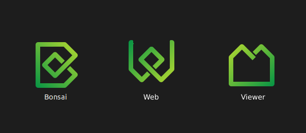
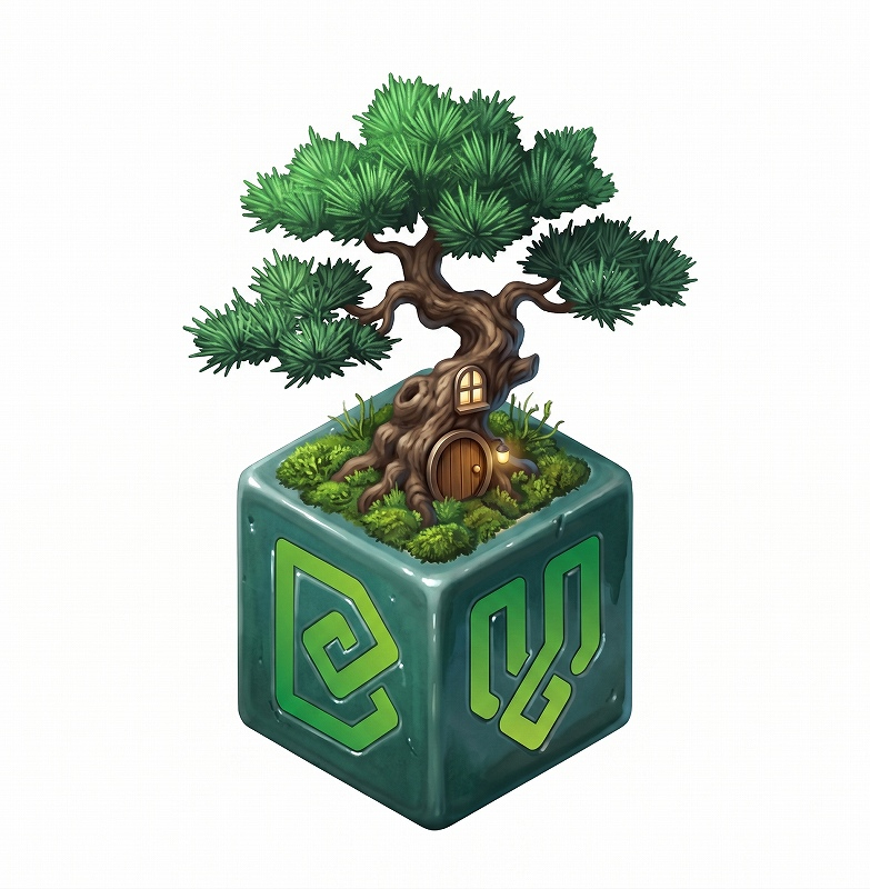
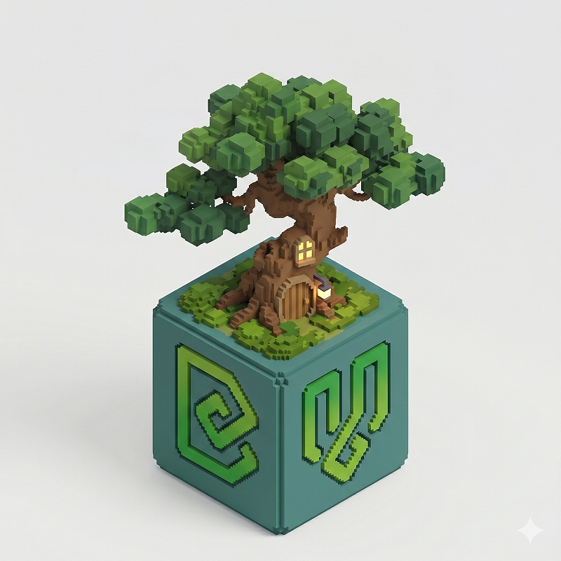
I like how IfcOpenShell has a logo family - bonded by colour, but also by shape for the main ones (Python, Convert). I think Bonsai should also follow suite (i.e. similar green colours and ideally a shape variant). I quite like the "leaf" thing.
From:
I read that as meaning you cannot use the Blender logo in your own logo even if you preserve it's original unadulterated form.
This is just a brief fiddle with an idea - i.e. it would need a lot more work:
Not to insist, in any way, that we should use Blender's logo; just to clarify for future ideas:
@sjb007 said:
I read that as meaning you cannot use the Blender logo in your own logo even if you preserve it's original unadulterated form.
I read that those are the rules for Blender's community badge, not for the logo:
For the logo, applied as a secondary element, I understand that those apply:
There are a few examples of other tools referencing Blender's logo, even commercial software, so I guess Bonsai (as an open-source initiative) would be fine...
@FeeBarradas Yeah, looks like a snapped the wrong section - my bad. I'd say that the correct text you posted actually emphasizes my point even more. You can't use the Blender logo in your own logo - only to show that your application uses or connects with Blender in some way. The three examples you provide all have their own distinct logos that in no way incorporate or ape the Blender logo.
Just a little extra commentary on my suggested icons a couple of comments up...
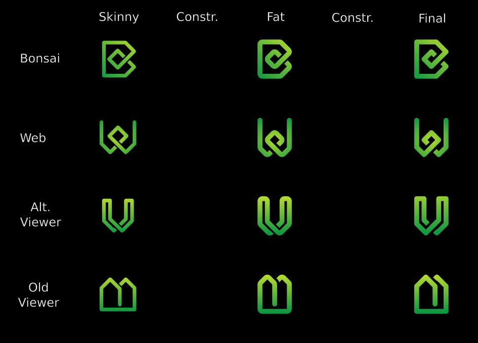
The original Bonsai icon was created by someone else (Dione maybe?), and inspired by the IFC/buildingSMART logo. I did some finessing on that to tidy up some minor inconsistencies, and then ended up tweaking all the other icons for IFCOpenShell.
My suggestion is trying to create a familial connection between the three applications so they look part of the same suite:
Bonsai is as it is.
The stylised "W" is obviously for Web. If you squint real hard you could make the central loop into the "world" in world-wide-web. It also looks a bit like a cable between two points. To finish it I'd round over the ends of the verticals, and shift the gradient so it is a radial, lighter in the center, darkening at the outer edge.
The Viewer is supposed to give an impression of buildings. To finish it I'd drop a vertical line down from that ended roof line in the center, making it look like two pitched roof buildings, one behind the other. I'd change the gradient to linear light on top, darkening to the ground.
The two new icons might have the colours changed to make use of other combinations of the IFCOpenShell palette, but I'm not sure if that is desirable, or feasible. Yellow is an awful colour for visibility on lighter backgrounds.
Looking at them side by side maybe the gradients need a tweak. The original Bonsai is very subtle, where I've gone a bit bolder on the new icons. Maybe they need to be closer, so either boost Bonsai, or reduce the impact in Web and Viewer.
[Edit] Subtle, not subtle:
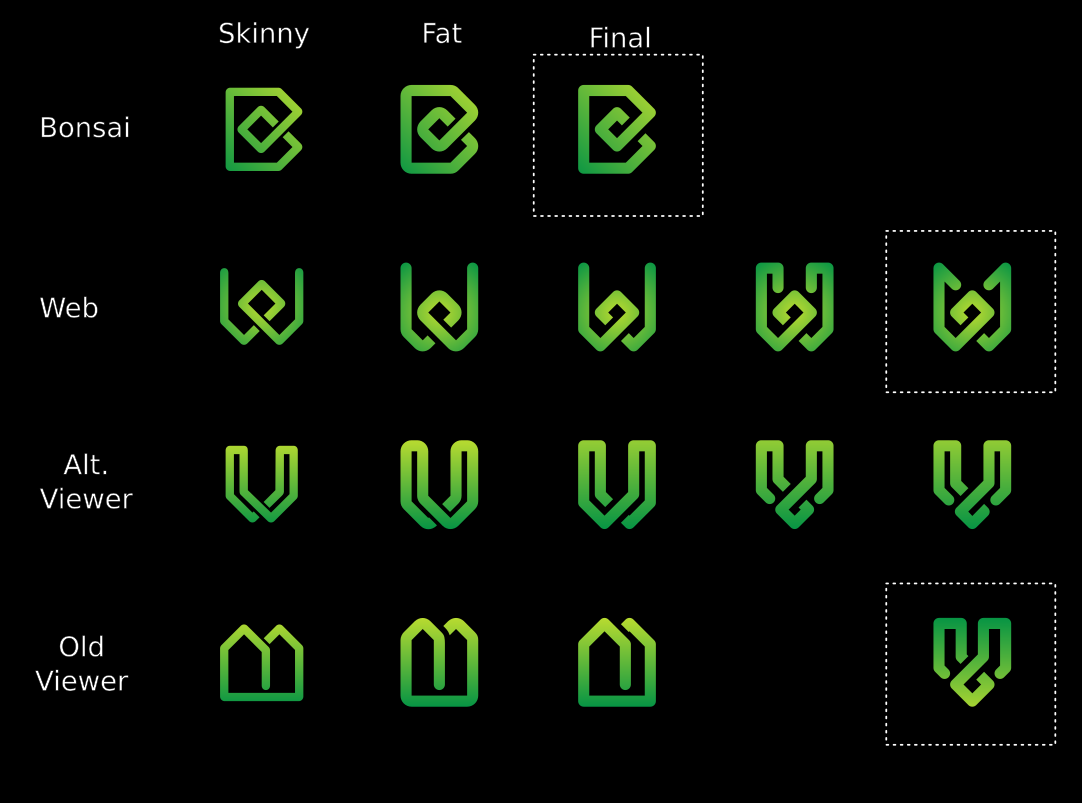
So I seem to have quite a few positive reactions on the icons. So here's my "workspace". I keep coming back to the IFC logo's shape, and also the idea of a single continuous pen stroke harking back to that trivial kids doodle of a house.
I marked the ones I think make a good, harmonious set:
I like the rounded line ends over the square ones.
The bolder gradient is a bit too much.
The Alt gradient just doesn't look nice, never mind the fact that it makes the viewer icon look like burning houses.
I also tried stylizing a V for the Viewer, but it isn't working. It's looks too heavy when sat with Bonsai and Web.
Note that these (like the previous) are designed on a 32x32 grid, so scale really nicely for any common bitmapped icon sizes, and I have a script that slices out each icon and optimizes the scalable svg in the event that these icons (or derivatives) are chosen.
Couple of variations. I like the ones marked Final (although that isn't meant literally):
And they scale down to very small sizes with good legibility:
Vanity shot, plus 16x16 px for favicon size, showing how perfectly clear and distinctive they are even at these very small dimensions. Pixel perfection!
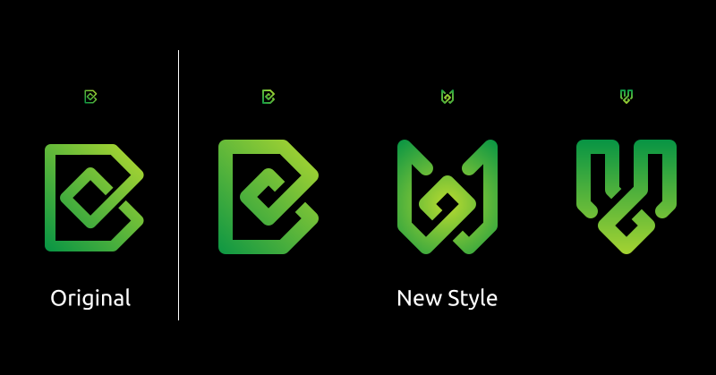
It looks great already, but I'd like to show you an alternative concept, for the sake of having a second option.
I really like the colors, gradient, contrast, thickness and scalability, it already looks professional and fine-tuned.
What I see as "not so great" in V and W:
Their shape look a bit too complex;
They don't refer so directly to Bonsai: you have to be familiar with Bonsai's colors/brand beforehand to know they're related;
They look too symmetric, reminds me of runes or alienware-like logos;
To address this, I sketched an alternative concept:
It's inspired by Alex King's famous "share icon" and the similarities between bonsai and graphs. Key features:
Simpler geometry, easier to remind the shapes;
Balanced, yet asymmetric (an "organic" feel, like a bonsai);
Visual coherence with ideas like "shared", "open-ended" (none are closed loops);
Reinforces the "B" as main brand and keeps "V" and "W" as secondary, open to future extensions
I know it doesn't look as well-polished as sjb007's (yet), but I wanted to show this, even if it only serves to confirm that the first option is better. If you don't like, it's totally fine - we already have a pro design ready.
I agree with @FeeBarradas I find the v and w quite complex in shape. I also find just w ("web") a bit plain as an independent logo. I also really like the leaf that was brought up in @FeeBarradas earlier proposals. I think backward slash + leaf really striking in clarity and a cool reference to the our bonsai tree: \🙒 Maybe it's worth exploring a combination.
Well thanks for the positive response. Not everyone likes them, and that's fine too. I'm not here to push them on anyone. They are what they are, and just a bit of fun to do.
Just for the record, and maybe useful for anyone presenting alternatives, here are some thoughts running through my head when working on these...
Assumptions:
The IfcOpenShell/Bonsai palette is fixed (Green, Yellow, Orange) with only two usable gradients (G-Y, Y-O) because G-O looks like ass.
The Bonsai "B" is not up for radical redesign.
As a group the new icons need to look familial, connected, cohesive, harmonious, yet still distinguishable from each other.
Throwing out either of the first two opens up a lot more options, but means a lot of new work for someone redesigning everything.
Requirements:
The new icons still needs to be distinctive and legible when used as a 16x16 pixel fav icon in a browser tab. (Use Inkscape's View > Icon Preview or Extensions > Export > Export Layer Slices to check 16x16 bitmaps)
At these extremes you have 3 things to work with:
The colour (here Green or Orange, because Yellow is terrible for contrast on light backgrounds)
The outline shape (too many circles or squares already)
Bold design (broad strokes, limit detail)
It should work in monochrome (black on white, white on black, or using spot colour(s) (i.e. Green) on black or white.
@aothms said:
I agree with @FeeBarradas I find the v and w quite complex in shape. I also find just w ("web") a bit plain as an independent logo. I also really like the leaf that was brought up in @FeeBarradas earlier proposals. I think backward slash + leaf really striking in clarity and a cool reference to the our bonsai tree: \🙒 Maybe it's worth exploring a combination.
I think we're coming up to a release time. The core around the viewer is now stabilising with cross platform support. This means we're going to start getting ready for release and focusing on docs, building, and merging.
@sjb007 is it possible to share the icons in SVG format? I think your icons are proving popular! If anybody has any more icon suggestions this is the time to post :)


Comments
Definitely think we should try to have some clarity and build upon the existing brands and logos,
IfcOpenShell is for coders as Bonsai is for users
- Bonsai Add-on for Blender ( Author )
- Bonsai Viewer ( Review & More )
- Bonsai Web or Bonsai Web Viewer ( Review & More )
For the web app, if we build similar features, share the same User Interface as the desktop Bonsai Viewer, then it can be considered as the "web" version of Bonsai Viewer. This sentence would sound good: "The web version can be accessed at viewer.bonsaibim.org "
We can keep the www.bonsaibim.org homepage as is and clearly present all three user-facing products, with a "Download Button"/"Go To". Download is pressed -> New page loads: download starts + getting Started video shows up/guides.
I also had a couple logo's generated. This is the one I liked best.
Exploring a "logo family" approach, any thoughts? (to be fine tuned)
I like how IfcOpenShell has a logo family - bonded by colour, but also by shape for the main ones (Python, Convert). I think Bonsai should also follow suite (i.e. similar green colours and ideally a shape variant). I quite like the "leaf" thing.
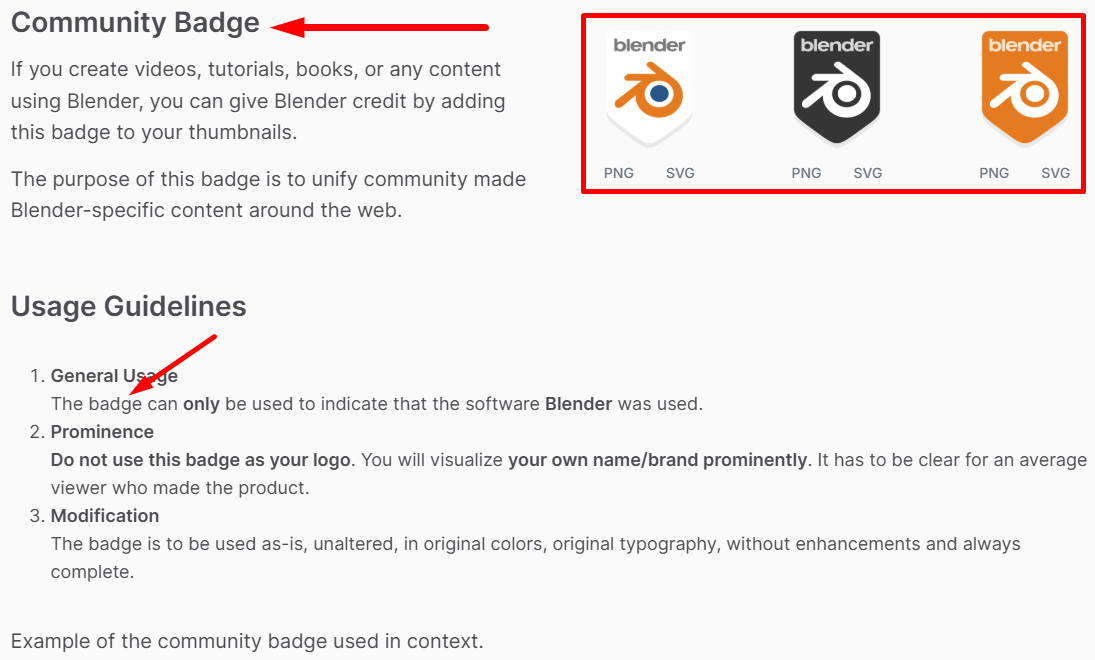
For Blender, note that if we use the Blender logo, we need to follow their community badge design unaltered: https://www.blender.org/about/logo/#community
From:
I read that as meaning you cannot use the Blender logo in your own logo even if you preserve it's original unadulterated form.
This is just a brief fiddle with an idea - i.e. it would need a lot more work:
Not to insist, in any way, that we should use Blender's logo; just to clarify for future ideas:
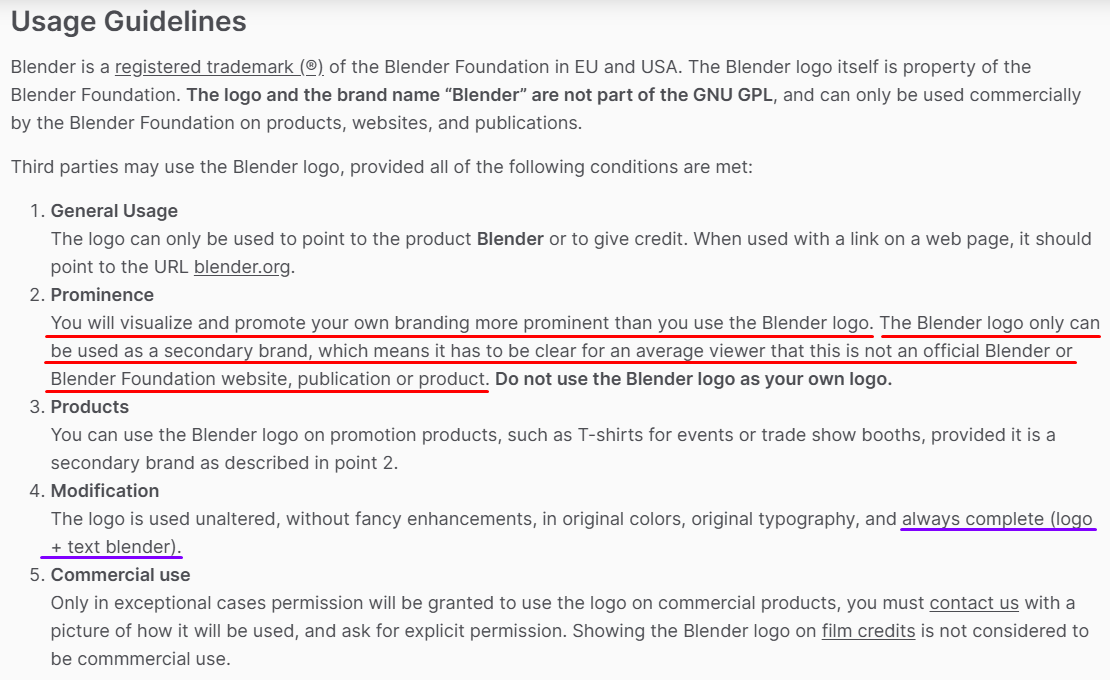
I read that those are the rules for Blender's community badge, not for the logo:
For the logo, applied as a secondary element, I understand that those apply:
There are a few examples of other tools referencing Blender's logo, even commercial software, so I guess Bonsai (as an open-source initiative) would be fine...
Speckle for blender
V-ray for blender
D5 render for blender
@FeeBarradas Yeah, looks like a snapped the wrong section - my bad. I'd say that the correct text you posted actually emphasizes my point even more. You can't use the Blender logo in your own logo - only to show that your application uses or connects with Blender in some way. The three examples you provide all have their own distinct logos that in no way incorporate or ape the Blender logo.
Just a little extra commentary on my suggested icons a couple of comments up...
The original Bonsai icon was created by someone else (Dione maybe?), and inspired by the IFC/buildingSMART logo. I did some finessing on that to tidy up some minor inconsistencies, and then ended up tweaking all the other icons for IFCOpenShell.
My suggestion is trying to create a familial connection between the three applications so they look part of the same suite:
The two new icons might have the colours changed to make use of other combinations of the IFCOpenShell palette, but I'm not sure if that is desirable, or feasible. Yellow is an awful colour for visibility on lighter backgrounds.
Looking at them side by side maybe the gradients need a tweak. The original Bonsai is very subtle, where I've gone a bit bolder on the new icons. Maybe they need to be closer, so either boost Bonsai, or reduce the impact in Web and Viewer.
[Edit] Subtle, not subtle:
What about ....
instead of the forbidden Bonsai (for) Blender Logo ...
Bonsai + Bonsai Web + Bonsai Viewer
or
Bonsai App/BIM/Author + Bonsai Web + Bonsai Viewer (+ Bonsai BOM + Bonsai 5D + Bonsai FEM + Bonsai Bidding + ...)
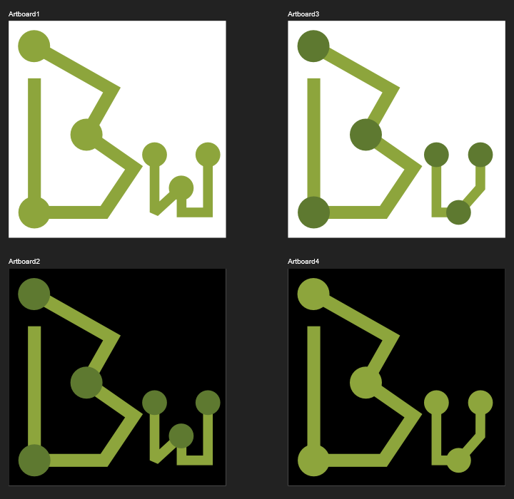
So I seem to have quite a few positive reactions on the icons. So here's my "workspace". I keep coming back to the IFC logo's shape, and also the idea of a single continuous pen stroke harking back to that trivial kids doodle of a house.
I marked the ones I think make a good, harmonious set:
Note that these (like the previous) are designed on a 32x32 grid, so scale really nicely for any common bitmapped icon sizes, and I have a script that slices out each icon and optimizes the scalable svg in the event that these icons (or derivatives) are chosen.
I agree with the preferred. However can we try with a thicker stroke? It feels a bit thin. I personally prefer the "v" than the house.
Anything useful in here?
Do you mean thicken the stroke everywhere, including the original Bonsai B? I'll give it a whirl, and I'll clean up the "V" version too.
Couple of variations. I like the ones marked Final (although that isn't meant literally):
And they scale down to very small sizes with good legibility:
I knew it... they weren't final. I do seem to be trending to some sort of Runic/Celtic feel.
Vanity shot, plus 16x16 px for favicon size, showing how perfectly clear and distinctive they are even at these very small dimensions. Pixel perfection!
I love it! What does everybody else think?
I pictured the icon for a Windows desktop app. LOL
It looks great already, but I'd like to show you an alternative concept, for the sake of having a second option.
I really like the colors, gradient, contrast, thickness and scalability, it already looks professional and fine-tuned.
What I see as "not so great" in V and W:
To address this, I sketched an alternative concept:
It's inspired by Alex King's famous "share icon" and the similarities between bonsai and graphs. Key features:
I know it doesn't look as well-polished as sjb007's (yet), but I wanted to show this, even if it only serves to confirm that the first option is better. If you don't like, it's totally fine - we already have a pro design ready.
I agree with @FeeBarradas I find the
vandwquite complex in shape. I also find justw("web") a bit plain as an independent logo. I also really like the leaf that was brought up in @FeeBarradas earlier proposals. I think backward slash + leaf really striking in clarity and a cool reference to the our bonsai tree: \🙒 Maybe it's worth exploring a combination.Well thanks for the positive response. Not everyone likes them, and that's fine too. I'm not here to push them on anyone. They are what they are, and just a bit of fun to do.
Just for the record, and maybe useful for anyone presenting alternatives, here are some thoughts running through my head when working on these...
Assumptions:
Throwing out either of the first two opens up a lot more options, but means a lot of new work for someone redesigning everything.
Requirements:
The new icons still needs to be distinctive and legible when used as a 16x16 pixel fav icon in a browser tab. (Use Inkscape's View > Icon Preview or Extensions > Export > Export Layer Slices to check 16x16 bitmaps)
At these extremes you have 3 things to work with:
It should work in monochrome (black on white, white on black, or using spot colour(s) (i.e. Green) on black or white.
Good Luck, Have Fun, Don't Die!
I second this, but the direction looks great!
Here's my tongue-in-cheek "less complicated" versions:

Fantastic, optimised and efficient. You have my vote. Is it time to settle the packaging design debate and get back to content :)
I think we're coming up to a release time. The core around the viewer is now stabilising with cross platform support. This means we're going to start getting ready for release and focusing on docs, building, and merging.
@sjb007 is it possible to share the icons in SVG format? I think your icons are proving popular! If anybody has any more icon suggestions this is the time to post :)
@Moult Sure. Do you want them in a pull request, attached here, or sent to an e-mail address?
Either, [email protected] if you prefer.
Should be in your inbox.