@Moult I mean change to this page: http://osarch.org - I'm not sure if others have access to that. @JQL I don't think there will be much clarity before we do some more work on what we are as an organization. But I'm pretty sure the main text at the wiki explains what we are. There is a longer text, but the theme is the same. Basically OSArch will become exactly what people are willing and able to make it. If you see a problem or two that needs fixing - go ahead and fix it. I think a newsletter would be a great idea. Maybe a monthly blog, maybe a podcast with interviews, whatever. For now though no-one can speak for OSArch, we just all support a common goal.
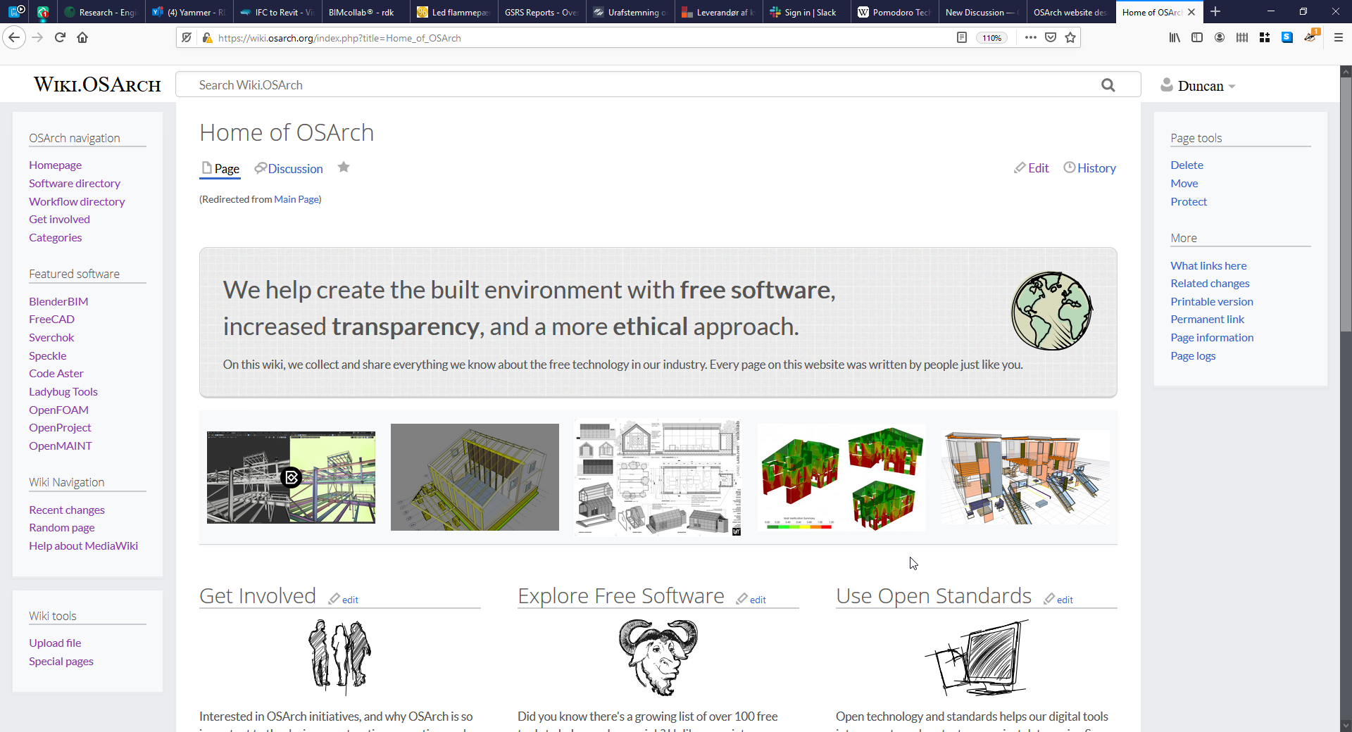
I reorganized the landing page, I think it should give a clearer message of our aim now. I hope I haven't broken any links, I added an Archicad category, the rest of the links that used to be on the main page and don't fit the the new structure should be easily found in the proper category. https://wiki.osarch.org/index.php?title=Home_of_OSArch
At some point there was questioning about the wiki tool. I can't find the post and if it was in this thread. MediaWiki is supposed to be known by almost everyone as it is the engine behind Wikipedia but it always feels cumbersome to me. I am also a little tired to switch from markdown which is almost used everywhere now to MediaWiki.
@JanF see if the you like the new design. Do you think that's a fair and useful selection of featured software? I wanted to show more than just modelling software. I'll start a separate thread asking how we want our software pages to look.
Decrease the scrollbar on the homepage. A long scroll means a users get intimidated.
Make the layout look more modern, I've used open source fonts like Open Sans (headings) and Lato (body) to provide a more modern & lighter look and feel. I've also removed the bright primary colours at the header and footer, and softened the search bar with rounded corners.
Make the homepage less texty. A big blurb with a short sentence (the long explanation can be migrated to the "read more about osarch" page), and some more graphical elements.
Made the three main portions of the site more obvious by creating a 3 column layout (get involved, learn software, learn concepts)
Reworded article titles (I didn't move any pages yet) to focus on user "how to" terminology to make the content more relatable
Added more links to the more fleshed out pages which I think would give users a typical idea of the wiki content at a glance without needing to search or click through more links.
If you think it's a movement in the right direction, let me know and I'll merge it to the homepage, and we can continue to tweak and write more content.
A note that @Cyril and I also tested WikiJS, which is a bit more "modern" than Mediawiki and supports Markdown, which can lower the barrier to entry to contributors. There were a few issues, which when put together, mean that I would feel uncomfortable with migrating:
No auto migration script
Guests cannot edit, you need an account
A page can be authored with a visual editor, markdown, or HTML, but once it is authored, it is locked for life to use that syntax.
No way of seeing a feed of recent changes for monitoring / auditing
Proposed homepage looks clearer to me. I just find that the Explore Free Software title seems passive and don't expect how to in this section. Maybe Use instead of Explore.
Any "Rich text editor" plugin available ?
Could be a better option so user will not have to deal with any "low level" html / markdown, but rather use javascript powered text editor with good looking set of icons for common styles like the simple one we do have here.
I think it goes in the right direction, maybe we can discuss what the three columns should be, but the three column thing is also the direction I was thinking of going. The three columns I've been toying with are
Learn | Create | Contribute
Learn: Theory, BIM, OpenBIM, IFC ...
Create: Software list, how to, workflows, guides ...
Contribute: Learn to code, donate, discussion forum, IRC ...
(those are not suggestions for articles or anything, just me thoughts on the type of content)
I suggest we just switch to it and work on it from there. @Moult I couldn't find the link you mentioned to the IRC channel. Can you add that to the 'Get involved section'.
I want to merge this with the https://community.osarch.org/discussion/114/osarch-website-design discussion. Do we agree we want to keep things in the same discussions? It makes it easier for people to subscirbe to relevant discussion without having to watch for related posts all the time. I know I'd prefer it.
@duncan cheers, I've merged the posts. Apologies for not keeping it in the right discussion.
As people seem to think it's a step in the right direction, I've now copied it over to the main homepage. Feel free to continue hacking on it! I like the three words "Learn | Create | Contribute", I think they make sense. Please go for it!
I have also upgraded Mediawiki to 1.35.0, which is the latest version. No doubt there will be some subtle improvements. One big improvement is that the page editor now contains buttons to help create the correct markup.
1.35.0 also comes with a much nicer visual rich editor (@stephen_l) but unfortunately there seems to be a bug where it works for new pages, but breaks in a funky way if you want to edit an existing page created prior to v1.35.0 (@Cyril and I spent some time trying to track the bug down!). Other users are experiencing the same bug, so we'll just wait for it to be fixed before rolling it out.
@ReD_CoDE that repo is for Github docs itself, not for users to create their own documentation, I think.
@ReD_CoDE that issue seems to be about providing an API to the Github docs, not about making the software standalone so people can host their own docs.
@Moult it's exactly for providing a package for individuals
The API, for instance GraphQL, is for managing data transformation through communication
GitHub chose GraphQL instead of REST to do that
Inspired by @bitacovir's proposal, I'd like to standardise the "look and feel" of the Wiki, Community, and OSArch landing page. There are three aspects I see to this:
A logo, repeated across all three sites
A colourscheme, repeated across all three sites.
A typeface, repeated across all three sites
For the third, I have gone ahead and swapped it out to Open Sans for all headers, and Lato for all body text. They are both open source and battle-tested standards, suitable for text-heavy content such as wiki and forums. There is some work to be done to standardise font sizes, and I will slowly tweak this as time goes.
Can I get some thoughts on the colourscheme? This colourscheme will be used to standardise background colours, text colours, link colours, button colours, across all pages. Doing this step is relatively easy and can do a lot for unification of the design. Do we want to continue with a light colour scheme, or do we want to swap to a dark theme?
Links are extremely important in a Wiki. They should be clearly identifiable, with three distinct colours for regular links, visited links, and non-existant page links.
Pages may have lots of graphics, including screenshots of applications. How does this work with the colour scheme?
I would personally like to get the colourscheme and all fonts + font sizes finalised by the end of November. Then, we can document it on the Wiki and stick to it for all future branding exercises.
I like more the colour scheme of the community. And I am a fan of dark themes, I find them more relaxing for the eyes and also more sustainable from an energy consumption perspective
I would strongly suggest using a different layout for mobile devices, on my phone is the wiki homepage in the current format completely unreadable. @Moult@duncan
Also, I have to admit I am not convinced this was a step in the right direction.
1. The three topics are great, but splitting the main area vertically does not improve readability and takes away the impact of the three headlines, by the way the classical wiki layout already is a three column layout (left menu, main content, right menu) .
2. Splitting the main area is kind of confusing, since the classical wiki layout is so ubiquitous so everyone is used to it.
3. None of the other osarch wiki pages can use a format with the main area split into three columns.
4. Maybe it's just me, but I subconsciously expect the welcome text on the white background under the headline and kind of skip the parts in the darker rectangles - I expect some additional info there, not the main content.
I feel like this organization would be put to a much better use on the osarch main page, wiki is supposed to be clear and informative and boringly effective in communicating information, it is the home page which should be cool and playful. If we need a more cool looking wiki, I find for example the https://www.bimpedia.eu/ looks ok and the tiles scale much better to the different devices than a fixed number of columns.
@JanF has an important point on readability we need to make that just work. Columns as the wiki presents them on a narrow screen are not really acceptable. On a narrow screen it would be okay if they were three tabs or something, but there is not enough space for three columns. Maybe that can be fixed in the CSS but it's been years since I've played with CSS.
Maybe it's time for a stripped down eye-candy version of what is notw the wiki front page (latest version with the three columns) for the osarch front page? We've got enough content to do it and we can probably control the formatting much better on the front page. What the backend CMS @Moult ? Depending on the system I'm sure someone has the time and skills to do it (besides you :-) )
Are there bootstrap or fundation templates available ? Such templates are likely to solve color scheme (user pref based) and mobile accessibility issues.
@JanF sorry, I didn't make it responsive as it was still just a mockup. I've now fixed it and made it responsive, so on small devices, it will revert to a single column layout.
@stephen_l I have a personal gripe with bootstrap, but I've now loaded in the Skeleton grid, so if we do want responsive column layouts within the wiki anywhere, it is now possible.
I created some graphics to complement the three categories. The graphics embody what I personally believe should be part of the "identity" of OSArch. You'll notice they are relaxed, casual, napkin-sketchy style graphics, similar to how I created the globe icon (I personally do not distinguish between the natural and the built environment, so I see the world as representative of the built environment). I feel this graphic style helps embody the character of open source communities - it's the opposite of corporate, vetted, and pristine - it's quick and dirty, and has character like a human.
I also hope to draw parallels between the quick idea-concept sketching that architects do when a design begins.
The new layout and little icons and all that stuff look freaking awesome. We're slowly getting there. Great that you had some time @Moult to look into it.
I'm not keen on that top section. I think it takes up too much space. Here's a picture of what's on my screen for my laptop. Pretty much all the page content is hidden
I think either the images or the banner or both need to go, but then something similar should be prominent on the osarch.org page. Compare for example the osgeo front page https://www.osgeo.org/ with the osgeo wiki https://wiki.osgeo.org/wiki/Main_Page
I think that's the direction where @JanF and I hope we can go. In architecture terms, a great lobby front page where you get a feel for the place (osarch.org ) - and then the library behind (wiki.osarch.org ).
I think we need a logo to focus our attention on color/style/font etc.
Pretty much exactly what @duncan said. Sketches are perfect, the top section is not great. That red-swampy-green image from code_aster haunts my dreams.
I also started thinking about a OSArch logo the other day and I'd like to put my draft of the homepage over the weekend together.


Comments
@Moult I mean change to this page: http://osarch.org - I'm not sure if others have access to that.
@JQL I don't think there will be much clarity before we do some more work on what we are as an organization. But I'm pretty sure the main text at the wiki explains what we are. There is a longer text, but the theme is the same. Basically OSArch will become exactly what people are willing and able to make it. If you see a problem or two that needs fixing - go ahead and fix it. I think a newsletter would be a great idea. Maybe a monthly blog, maybe a podcast with interviews, whatever. For now though no-one can speak for OSArch, we just all support a common goal.
I reorganized the landing page, I think it should give a clearer message of our aim now. I hope I haven't broken any links, I added an Archicad category, the rest of the links that used to be on the main page and don't fit the the new structure should be easily found in the proper category.
https://wiki.osarch.org/index.php?title=Home_of_OSArch
@duncan homepage updated! Thanks for the input!
@JanF I like it much better now! Your work is great!
At some point there was questioning about the wiki tool. I can't find the post and if it was in this thread. MediaWiki is supposed to be known by almost everyone as it is the engine behind Wikipedia but it always feels cumbersome to me. I am also a little tired to switch from markdown which is almost used everywhere now to MediaWiki.
Has anyone experimented Wiki.js ? It is :
Hi @Cyril I think there's a better choice. Check this out: https://github.com/github/docs
@duncan can we change the MediaWiki:Sidebar (main menu) to something like this?
OSArch navigation
** mainpage|mainpage-description
** AEC_Free_Software_directory|Software directory
** AECO_Workflow_Examples|Workflow directory
Featured software
** Category:BlenderBIM_Add-on|BlenderBIM
** Category:FreeCAD|FreeCAD
Wiki navigation
** recentchanges-url|recentchanges
** randompage-url|randompage
** helppage|help-mediawiki
I think the current menu is quite unattractive, especially for people who come more often.
@JanF see if the you like the new design. Do you think that's a fair and useful selection of featured software? I wanted to show more than just modelling software. I'll start a separate thread asking how we want our software pages to look.
Based off the comments from the monthly meetup I spent today redesigning the OSArch wiki homepage.
Before: https://wiki.osarch.org/index.php?title=Home_of_OSArch
After: https://wiki.osarch.org/index.php?title=User:Moult
The objectives:
If you think it's a movement in the right direction, let me know and I'll merge it to the homepage, and we can continue to tweak and write more content.
A note that @Cyril and I also tested WikiJS, which is a bit more "modern" than Mediawiki and supports Markdown, which can lower the barrier to entry to contributors. There were a few issues, which when put together, mean that I would feel uncomfortable with migrating:
Proposed homepage looks clearer to me. I just find that the
Explore Free Softwaretitle seems passive and don't expect how to in this section. MaybeUseinstead ofExplore.Any "Rich text editor" plugin available ?
Could be a better option so user will not have to deal with any "low level" html / markdown, but rather use javascript powered text editor with good looking set of icons for common styles like the simple one we do have here.
I think it goes in the right direction, maybe we can discuss what the three columns should be, but the three column thing is also the direction I was thinking of going. The three columns I've been toying with are
Learn | Create | Contribute
Learn: Theory, BIM, OpenBIM, IFC ...
Create: Software list, how to, workflows, guides ...
Contribute: Learn to code, donate, discussion forum, IRC ...
(those are not suggestions for articles or anything, just me thoughts on the type of content)
I suggest we just switch to it and work on it from there. @Moult I couldn't find the link you mentioned to the IRC channel. Can you add that to the 'Get involved section'.
I want to merge this with the https://community.osarch.org/discussion/114/osarch-website-design discussion. Do we agree we want to keep things in the same discussions? It makes it easier for people to subscirbe to relevant discussion without having to watch for related posts all the time. I know I'd prefer it.
@Moult This is the second time I suggest GitHub Docs: https://github.com/github/docs
Also, hopefully soon, they will have a ready-to-use package too: https://github.com/github/docs/issues/205
@duncan cheers, I've merged the posts. Apologies for not keeping it in the right discussion.
As people seem to think it's a step in the right direction, I've now copied it over to the main homepage. Feel free to continue hacking on it! I like the three words "Learn | Create | Contribute", I think they make sense. Please go for it!
I have also upgraded Mediawiki to 1.35.0, which is the latest version. No doubt there will be some subtle improvements. One big improvement is that the page editor now contains buttons to help create the correct markup.
1.35.0 also comes with a much nicer visual rich editor (@stephen_l) but unfortunately there seems to be a bug where it works for new pages, but breaks in a funky way if you want to edit an existing page created prior to v1.35.0 (@Cyril and I spent some time trying to track the bug down!). Other users are experiencing the same bug, so we'll just wait for it to be fixed before rolling it out.
@ReD_CoDE that repo is for Github docs itself, not for users to create their own documentation, I think.
@Moult check this out: https://github.com/github/docs/issues/205
@ReD_CoDE that issue seems to be about providing an API to the Github docs, not about making the software standalone so people can host their own docs.
@Moult it's exactly for providing a package for individuals
The API, for instance GraphQL, is for managing data transformation through communication
GitHub chose GraphQL instead of REST to do that
Inspired by @bitacovir's proposal, I'd like to standardise the "look and feel" of the Wiki, Community, and OSArch landing page. There are three aspects I see to this:
For the third, I have gone ahead and swapped it out to Open Sans for all headers, and Lato for all body text. They are both open source and battle-tested standards, suitable for text-heavy content such as wiki and forums. There is some work to be done to standardise font sizes, and I will slowly tweak this as time goes.
Can I get some thoughts on the colourscheme? This colourscheme will be used to standardise background colours, text colours, link colours, button colours, across all pages. Doing this step is relatively easy and can do a lot for unification of the design. Do we want to continue with a light colour scheme, or do we want to swap to a dark theme?
Here is the community's current scheme: https://coolors.co/ffffff-22252c-e14658-555555-888384
Here is the wiki's current scheme: https://coolors.co/ffffff-555555-eaecf0-3366cc-8e36ae
Things to consider:
I would personally like to get the colourscheme and all fonts + font sizes finalised by the end of November. Then, we can document it on the Wiki and stick to it for all future branding exercises.
I like more the colour scheme of the community. And I am a fan of dark themes, I find them more relaxing for the eyes and also more sustainable from an energy consumption perspective
I would strongly suggest using a different layout for mobile devices, on my phone is the wiki homepage in the current format completely unreadable.
@Moult @duncan
Also, I have to admit I am not convinced this was a step in the right direction.
1. The three topics are great, but splitting the main area vertically does not improve readability and takes away the impact of the three headlines, by the way the classical wiki layout already is a three column layout (left menu, main content, right menu) .
2. Splitting the main area is kind of confusing, since the classical wiki layout is so ubiquitous so everyone is used to it.
3. None of the other osarch wiki pages can use a format with the main area split into three columns.
4. Maybe it's just me, but I subconsciously expect the welcome text on the white background under the headline and kind of skip the parts in the darker rectangles - I expect some additional info there, not the main content.
I feel like this organization would be put to a much better use on the osarch main page, wiki is supposed to be clear and informative and boringly effective in communicating information, it is the home page which should be cool and playful. If we need a more cool looking wiki, I find for example the https://www.bimpedia.eu/ looks ok and the tiles scale much better to the different devices than a fixed number of columns.
@JanF has an important point on readability we need to make that just work. Columns as the wiki presents them on a narrow screen are not really acceptable. On a narrow screen it would be okay if they were three tabs or something, but there is not enough space for three columns. Maybe that can be fixed in the CSS but it's been years since I've played with CSS.
Maybe it's time for a stripped down eye-candy version of what is notw the wiki front page (latest version with the three columns) for the osarch front page? We've got enough content to do it and we can probably control the formatting much better on the front page. What the backend CMS @Moult ? Depending on the system I'm sure someone has the time and skills to do it (besides you :-) )
Are there bootstrap or fundation templates available ? Such templates are likely to solve color scheme (user pref based) and mobile accessibility issues.
@JanF sorry, I didn't make it responsive as it was still just a mockup. I've now fixed it and made it responsive, so on small devices, it will revert to a single column layout.
@stephen_l I have a personal gripe with bootstrap, but I've now loaded in the Skeleton grid, so if we do want responsive column layouts within the wiki anywhere, it is now possible.
For comparison:
Let me know which one prefer, and I'll update it :) (or, make your own proposal on your wiki User page! Everybody can contribute!)
In the meantime... colour scheme preferences?
I clearly prefer this one.
I created some graphics to complement the three categories. The graphics embody what I personally believe should be part of the "identity" of OSArch. You'll notice they are relaxed, casual, napkin-sketchy style graphics, similar to how I created the globe icon (I personally do not distinguish between the natural and the built environment, so I see the world as representative of the built environment). I feel this graphic style helps embody the character of open source communities - it's the opposite of corporate, vetted, and pristine - it's quick and dirty, and has character like a human.
I also hope to draw parallels between the quick idea-concept sketching that architects do when a design begins.
Have no strong preference, but to me responsive laout is a priority.
The new layout and little icons and all that stuff look freaking awesome. We're slowly getting there. Great that you had some time @Moult to look into it.
I'm not keen on that top section. I think it takes up too much space. Here's a picture of what's on my screen for my laptop. Pretty much all the page content is hidden
I think either the images or the banner or both need to go, but then something similar should be prominent on the osarch.org page. Compare for example the osgeo front page https://www.osgeo.org/ with the osgeo wiki https://wiki.osgeo.org/wiki/Main_Page
I think that's the direction where @JanF and I hope we can go. In architecture terms, a great lobby front page where you get a feel for the place (osarch.org ) - and then the library behind (wiki.osarch.org ).
I think we need a logo to focus our attention on color/style/font etc.
Pretty much exactly what @duncan said. Sketches are perfect, the top section is not great. That red-swampy-green image from code_aster haunts my dreams.
I also started thinking about a OSArch logo the other day and I'd like to put my draft of the homepage over the weekend together.
I've created a separate discussion for "look and feel" as it's not just about the website. I suggest this thread can keep a focus on the wiki with layout and content, while the new thread can be about look and feel in general across all media.
https://community.osarch.org/discussion/300/standardising-the-look-and-feel-aka-style-guide/p1?new=1