Wow, this got quite some response. Thank you all for your input.
Thanks @Moult for all the work on the new Blender BIM workspace layout. I was using BlenderBim v0.0.230701 before, but now with a dedicated BIM workspace it all starts to make more sense.
And thank for your insight in where you see BlenderBim in its current development stage. To be in the early stages of AEC software based in a common open standard reminds me a bit of Linux, where some Geeks hack something in existence to build an alternative. It ain’t pretty, but it is a start.
Metaphorically speaking, I hope that someday there will be a "macOS" too, which has under the hood has a lot of common with "Linux", but focuses a lot more on the UX for not so technically versed users (while still maintaining the ability to do so if needed). Sorry "Windows", but in the scope of this simplified comparison, you would be Autodesk.
What I can read from a lot of the comments is, that many of the current users of BlenderBim are somewhat technically comfortable to use the IFC schema directly. Or to learn the schema specifications and adapt to a technically challenging environment.
I‘d guess about 20-25% of users in the AEC business are able and comfortable to do so. But most would rather choose a tool which gets the job done the fastest and is as close to their native domain language as possible, even if it locks you in. Or as an evil actor just convincingly pretends to be easy.
So the future challenge IMV would be to allow for an easy workflow and UX, while maintaining IFC schema compliance. In the end the tool which allows for the most human native workflow will win (in terms of adoption). IMHO not humans should adapt their workflow to computers, but the other way around. Computers/Apps should be build to allow for an intuitive human workflow, while doing the stuff necessary to be technically correct behind the scenes automatically.
Sidenote:
Somewhere above in this thread was a lightheartedly response of "if it ain't broke...".
Just think about it and its implications. It would mean living of substance until stuff breaks. The opposite is called Maintenance with constant fixing and improvement so that stuff does NOT break in the first place. I‘d rather choose the later.
Just to add on the 'IFC schema is a specialist/poweruser/expert common language'. It is true that the IFC schema is not easy if you look at the full schema. However I feel there is like a front & back-end to IFC if this comparison makes sense, some parts of the schema are visible like entities, materials, property(sets) whilst relations and geometry representations (brep etc..) are less or not visible (depending of what tool you use i'd say). BlenderBIM does a good job of showing what needs to be showed (a perfect tool to learn IFC) and hiding what needs to be hidden for non-power users. I feel like this front end is not hard to understand and non-technical people should be able to understand this part of the schema and speak this common language. The back end however i feel is not needed for end-users.
True as an open common data format/scheme for interoperability. But for direct user interaction? Maybe not so much. Just think about the popularity of Markdown compared to pure HTML in content creation.
Thought: Maybe in the long run with growing complexity and scope of IFC there will evolve a new meta format which simplifies creating building "content", which then ist converted by automatic scripts to semantically correct IFC.
It is similar in that HTML and IFC are usually an unstructured mess exported or generated from a database. The difference is that IFC can be that database.
I've been giving this quite a lot of thought and here's my current proposal which hopefully should satisfy both points of view.
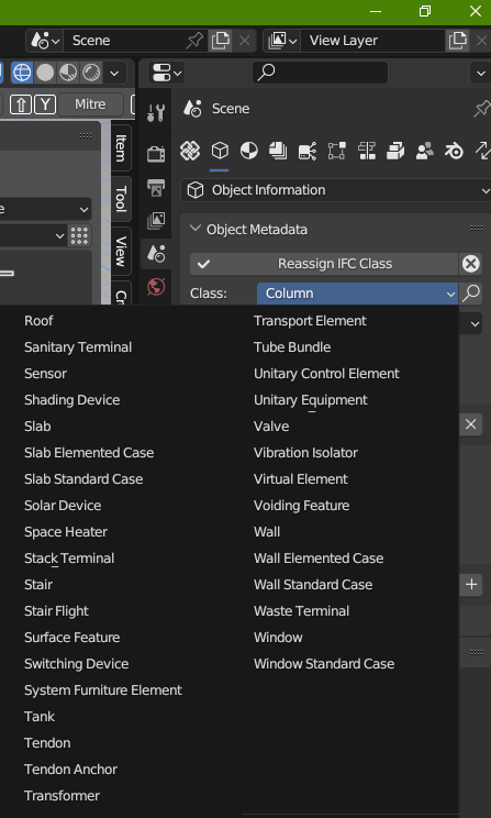
The "IFC" prefix will be removed on panel names. For example if the panel header was named "IFC Aggregates" it shall now be named "Aggregates". This is to prevent every single panel being prefixed with "IFC" which is redundant and not necessary now that we have all IFC panels in one UI spot (or will be, as things continue to converge into the new tab system). However, I will not change the word "Aggregates" or other similar terms as it is a very specific jargon in IFC and I think that is important.
For now, I will undo the change I made to convert terms like "IfcSpaceHeater" (such as in that dropdown above by @Nigel) into "Space Heater". This means that the UI will go back to referring to it explicitly as "IfcSpaceHeater". It is clear that there are two camps here, one camp in favour of more prominently showing the IfcJargon and another camp in favour of more prominently showing the Readable Jargon (and perhaps the IfcJargon delegated to tooltips, etc). The reason I propose to undo it is because I believe although both camps are important, we are from a technical perspective not ready at this time to support the "Readable Jargon". Rushing into it will lead into technical debt and having to redo things later on.
Specifically, I believe right now effort should be focused on getting the big-picture UX correct first: the big reshuffling of panels and recategorisation. This I believe will have a bigger impact on usability given the effort spent. Only after this is it worthwhile to focus on the details like the exact words within panels.
Only after this big-shuffling is done, then instead of focusing on "IfcFoo" vs "Foo", I propose to first focus on i18n. I do not want to jump into a solution where we start hardcoding text replacement functions like "IfcFoo" -> "Foo" without a i18n system in place. The i18n system would then support people who want "IfcFoo" versus language-specific terms or autogenerated simple English. In addition, a proper i18n system would be part of an onboarding process: i.e. the first time you install BBIM, it will know it is not yet configured and prompt you to set global add-on settings like your language (or even other things like orbit presets blah blah but that's another UX discussion altogether). This is similar to how when you first load Blender, it prompts for things like theme, shortcuts, etc. This is essentially the "create a config toggle" solution but the way it's presented would be a smoother experience than hiding it in the add-on settings.
@Moult I don't think anyone can contest your commonsense proposal, not me anyway
I think seeing the new BIM workspace generated a lot of interest in UI/UX and that is a good response
Pardon for jumping into an ongoing discussion from both last online meetup and the further extension on the UI talk here.
Is there a limitation towards using the right panel in the blender code? Would it be a technical challenge to have special made panel be in the upper center of the active working scene? When overlooking the UI talk, I can potentially see that the standard blender panel has a limitation towards how much info you can compress into the existing information panel. Icons is small and also some supportive text is the same. Would it therefore be possible to disengage from blender UI by having some of the info in it's own panel in a horizontal design? As for architects and engineers alike, I assume we use a big cad screen which allows us to have more info on display doe the active scene we work in.
@Ole_Marius_Svendsen nothing is stopping you from re-laying out your panels however you wish. This is merely the default. Have you got a screenshot of what type of horizontal layout you had in mind? I could then let you know whether it's achievable.
We do have some horizontal panel in BIM Tool and in another tools UI but in Blender it's pretty limited. I'm not sure if it's even possible to have two rows of operators/properties there:
If we need horizontal panel we can kind of fake it by adapting some other panel that allows using more complex UI (like Properties):
@Ole_Marius_Svendsen said:
It's not within my knowledge if a specific UI is patent. Though as one example, revits UI is a bit more straight forward as an example.
Is it both realistic, and doable to have a panel in the horizontal direction underneath blenders panel? I'm referring to nr 13-15.
I would dislike to see a similar UI in Blender. Blender UI/UX is in my opinion far better. (I also come from Autocad/Revit). Have you tried to play with Blender for a while following some tutorials? Yes it is very different but Autodesk world neither universal neither in my opinion the best in term of UI/UX. In CAD world look at CATIA which is largely used and many other software (ArchiCAD, Vectorworks etc...).
My usage of Revit stretches as far back as 2013 as a credited course during my education. So, i would say i am novice in both Blender and Revit. As for how long i have been playing around, i would say now and then privat and a bit specific usage for my line of work. If CATIA has a better UI, then i am more than confident the on-going discussion on improvement on the overall graphical design choices are in good hand. The best as far i can tell is to shop around for what works in different softwares. The latest monthly meetup displayed good intentions into how and where different functionality should be placed.
If you feel today's placement of information is well suited to where it is today. Im sure you could elaborate a bit on why not going to the extreme as my UI inquiry and Andrej's suggestion?
I remember similar conversations when software went from DOS to Windows :) or the old Mac versus windows (insert yawn here) debate. Or 'SketchUp doesn't have enough icons to be proper software'
It is worth asking yourself 'is it better or different?' and 'am I experiencing familiarity bias or exercising objective thinking?'?
Have you checked out the BIM Tool? When it comes to actual editing, the workspace tools provide essentially a vertical "ribbon":
That said, I think I know what you mean. If we look past the "which overall UI paradigm is preferred debate" what I think you actually mean is that new users are looking for "hey, wheres the big "Wall Tool" icon for me to click on to draw walls?" If I install new BIM software, I expect to see nice big shiny buttons to let me draw walls, doors, windows, furniture, ducts, pipes, columns, etc.
In BBIM, you have to click a rather innocent looking unlabeled nondescript cube and hope the user was informed enough to load the demo library then find a small dropdown in the top left (since the big tool panel with the preview is hidden by default). This is 3 clicks with the demo library and 9 clicks without. For powerusers these 3 clicks accurately resemble the decoupling of geometry and semantic types. For new users these 3 clicks are a slap in the face from a developer who clearly doesn't know that I JUST NEED TO DRAW WALLS. In less crude terms, new users need maximum discoverability (logic behind the ribbon) ... so I totally see your point.
Up until now the discussion has been around the properties panels. There hasn't been much discussion around the workspace authoring tools (which I think is what you're actually addressing).
Here's a proposed solution that is fitting with the Blender UX: 1) big icons in the tool shelf (Blender icons are 16x16px). 2) This effectively acts as a preset to the BIM Tool. 3) Provide quick ways to create basic (i.e. default) wall / door / window instead of having them to click through the type manager. Here's what it looks like.
You can of course change the scale yourself or even have two columns. But the usability point stands: now the Tool Shelf holds what you'd expect: A Wall Tool. This reduces the demo module clicks from 3 down to 1, and a fresh project from 9 clicks down to 2. Nice!
This also allows us to have hotkeys to quickly switch to most common object types (walls, slabs, doors, windows...) or via shift-space hotkey so your mouse doesn't have to move far.
I think you summarized my intention rather well Moult. Regardless of final UI design, a welcoming and somewhat self-explained icons reduce a potential user anxiety learning a new software.
I really like the tools icons on the tool shelf! It would let my colleagues and students get started much faster. I think it would also be good to follow the blender pattern of when you do something it does it with the defaults and then lets you modify the last operation afterwards. https://docs.blender.org/manual/en/2.82/interface/undo_redo.html#ui-undo-redo-adjust-last-operation
With the parametric nature of blenderbim this pattern can be applied not just to the last operation so why not not start with a simple default if changing the wall properties is a drop down away.
Really excited about where all this is going!
This also allows us to have hotkeys to quickly switch to most common object types (walls, slabs, doors, windows...) or via shift-space hotkey so your mouse doesn't have to move far.


Comments
Wow, this got quite some response. Thank you all for your input.
Thanks @Moult for all the work on the new Blender BIM workspace layout. I was using BlenderBim v0.0.230701 before, but now with a dedicated BIM workspace it all starts to make more sense.
And thank for your insight in where you see BlenderBim in its current development stage. To be in the early stages of AEC software based in a common open standard reminds me a bit of Linux, where some Geeks hack something in existence to build an alternative. It ain’t pretty, but it is a start.
Metaphorically speaking, I hope that someday there will be a "macOS" too, which has under the hood has a lot of common with "Linux", but focuses a lot more on the UX for not so technically versed users (while still maintaining the ability to do so if needed). Sorry "Windows", but in the scope of this simplified comparison, you would be Autodesk.
What I can read from a lot of the comments is, that many of the current users of BlenderBim are somewhat technically comfortable to use the IFC schema directly. Or to learn the schema specifications and adapt to a technically challenging environment.
I‘d guess about 20-25% of users in the AEC business are able and comfortable to do so. But most would rather choose a tool which gets the job done the fastest and is as close to their native domain language as possible, even if it locks you in. Or as an evil actor just convincingly pretends to be easy.
So the future challenge IMV would be to allow for an easy workflow and UX, while maintaining IFC schema compliance. In the end the tool which allows for the most human native workflow will win (in terms of adoption). IMHO not humans should adapt their workflow to computers, but the other way around. Computers/Apps should be build to allow for an intuitive human workflow, while doing the stuff necessary to be technically correct behind the scenes automatically.
Sidenote:
Somewhere above in this thread was a lightheartedly response of "if it ain't broke...".
Just think about it and its implications. It would mean living of substance until stuff breaks. The opposite is called Maintenance with constant fixing and improvement so that stuff does NOT break in the first place. I‘d rather choose the later.
Just to add on the 'IFC schema is a specialist/poweruser/expert common language'. It is true that the IFC schema is not easy if you look at the full schema. However I feel there is like a front & back-end to IFC if this comparison makes sense, some parts of the schema are visible like entities, materials, property(sets) whilst relations and geometry representations (brep etc..) are less or not visible (depending of what tool you use i'd say). BlenderBIM does a good job of showing what needs to be showed (a perfect tool to learn IFC) and hiding what needs to be hidden for non-power users. I feel like this front end is not hard to understand and non-technical people should be able to understand this part of the schema and speak this common language. The back end however i feel is not needed for end-users.
Interesting Tweet from BuildingSmartUK comparing IFC to HTML.
True as an open common data format/scheme for interoperability. But for direct user interaction? Maybe not so much. Just think about the popularity of Markdown compared to pure HTML in content creation.
Thought: Maybe in the long run with growing complexity and scope of IFC there will evolve a new meta format which simplifies creating building "content", which then ist converted by automatic scripts to semantically correct IFC.
It is similar in that HTML and IFC are usually an unstructured mess exported or generated from a database. The difference is that IFC can be that database.
Nice, the menu is faster to read without the IFC prefix, I guess we are programmed to skip through an alphabetical list by sighting the first letter
I've been giving this quite a lot of thought and here's my current proposal which hopefully should satisfy both points of view.
Specifically, I believe right now effort should be focused on getting the big-picture UX correct first: the big reshuffling of panels and recategorisation. This I believe will have a bigger impact on usability given the effort spent. Only after this is it worthwhile to focus on the details like the exact words within panels.
Only after this big-shuffling is done, then instead of focusing on "IfcFoo" vs "Foo", I propose to first focus on i18n. I do not want to jump into a solution where we start hardcoding text replacement functions like "IfcFoo" -> "Foo" without a i18n system in place. The i18n system would then support people who want "IfcFoo" versus language-specific terms or autogenerated simple English. In addition, a proper i18n system would be part of an onboarding process: i.e. the first time you install BBIM, it will know it is not yet configured and prompt you to set global add-on settings like your language (or even other things like orbit presets blah blah but that's another UX discussion altogether). This is similar to how when you first load Blender, it prompts for things like theme, shortcuts, etc. This is essentially the "create a config toggle" solution but the way it's presented would be a smoother experience than hiding it in the add-on settings.
Thoughts?
@Moult I don't think anyone can contest your commonsense proposal, not me anyway
I think seeing the new BIM workspace generated a lot of interest in UI/UX and that is a good response
Pardon for jumping into an ongoing discussion from both last online meetup and the further extension on the UI talk here.
Is there a limitation towards using the right panel in the blender code? Would it be a technical challenge to have special made panel be in the upper center of the active working scene? When overlooking the UI talk, I can potentially see that the standard blender panel has a limitation towards how much info you can compress into the existing information panel. Icons is small and also some supportive text is the same. Would it therefore be possible to disengage from blender UI by having some of the info in it's own panel in a horizontal design? As for architects and engineers alike, I assume we use a big cad screen which allows us to have more info on display doe the active scene we work in.
@Ole_Marius_Svendsen nothing is stopping you from re-laying out your panels however you wish. This is merely the default. Have you got a screenshot of what type of horizontal layout you had in mind? I could then let you know whether it's achievable.
It's not within my knowledge if a specific UI is patent. Though as one example, revits UI is a bit more straight forward as an example.
Is it both realistic, and doable to have a panel in the horizontal direction underneath blenders panel? I'm referring to nr 13-15.
We do have some horizontal panel in BIM Tool and in another tools UI but in Blender it's pretty limited. I'm not sure if it's even possible to have two rows of operators/properties there:


If we need horizontal panel we can kind of fake it by adapting some other panel that allows using more complex UI (like Properties):
I would dislike to see a similar UI in Blender. Blender UI/UX is in my opinion far better. (I also come from Autocad/Revit). Have you tried to play with Blender for a while following some tutorials? Yes it is very different but Autodesk world neither universal neither in my opinion the best in term of UI/UX. In CAD world look at CATIA which is largely used and many other software (ArchiCAD, Vectorworks etc...).
My usage of Revit stretches as far back as 2013 as a credited course during my education. So, i would say i am novice in both Blender and Revit. As for how long i have been playing around, i would say now and then privat and a bit specific usage for my line of work. If CATIA has a better UI, then i am more than confident the on-going discussion on improvement on the overall graphical design choices are in good hand. The best as far i can tell is to shop around for what works in different softwares. The latest monthly meetup displayed good intentions into how and where different functionality should be placed.
If you feel today's placement of information is well suited to where it is today. Im sure you could elaborate a bit on why not going to the extreme as my UI inquiry and Andrej's suggestion?
I remember similar conversations when software went from DOS to Windows :) or the old Mac versus windows (insert yawn here) debate. Or 'SketchUp doesn't have enough icons to be proper software'
It is worth asking yourself 'is it better or different?' and 'am I experiencing familiarity bias or exercising objective thinking?'?
Have you checked out the BIM Tool? When it comes to actual editing, the workspace tools provide essentially a vertical "ribbon":
That said, I think I know what you mean. If we look past the "which overall UI paradigm is preferred debate" what I think you actually mean is that new users are looking for "hey, wheres the big "Wall Tool" icon for me to click on to draw walls?" If I install new BIM software, I expect to see nice big shiny buttons to let me draw walls, doors, windows, furniture, ducts, pipes, columns, etc.
In BBIM, you have to click a rather innocent looking unlabeled nondescript cube and hope the user was informed enough to load the demo library then find a small dropdown in the top left (since the big tool panel with the preview is hidden by default). This is 3 clicks with the demo library and 9 clicks without. For powerusers these 3 clicks accurately resemble the decoupling of geometry and semantic types. For new users these 3 clicks are a slap in the face from a developer who clearly doesn't know that I JUST NEED TO DRAW WALLS. In less crude terms, new users need maximum discoverability (logic behind the ribbon) ... so I totally see your point.
Up until now the discussion has been around the properties panels. There hasn't been much discussion around the workspace authoring tools (which I think is what you're actually addressing).
Here's a proposed solution that is fitting with the Blender UX: 1) big icons in the tool shelf (Blender icons are 16x16px). 2) This effectively acts as a preset to the BIM Tool. 3) Provide quick ways to create basic (i.e. default) wall / door / window instead of having them to click through the type manager. Here's what it looks like.
You can of course change the scale yourself or even have two columns. But the usability point stands: now the Tool Shelf holds what you'd expect: A Wall Tool. This reduces the demo module clicks from 3 down to 1, and a fresh project from 9 clicks down to 2. Nice!
This also allows us to have hotkeys to quickly switch to most common object types (walls, slabs, doors, windows...) or via shift-space hotkey so your mouse doesn't have to move far.
I'm really excited to see the 'Create Pipe' icon...
I think you summarized my intention rather well Moult. Regardless of final UI design, a welcoming and somewhat self-explained icons reduce a potential user anxiety learning a new software.
I really like the tools icons on the tool shelf! It would let my colleagues and students get started much faster. I think it would also be good to follow the blender pattern of when you do something it does it with the defaults and then lets you modify the last operation afterwards. https://docs.blender.org/manual/en/2.82/interface/undo_redo.html#ui-undo-redo-adjust-last-operation
With the parametric nature of blenderbim this pattern can be applied not just to the last operation so why not not start with a simple default if changing the wall properties is a drop down away.
Really excited about where all this is going!
That is a good example> @Moult said:
This is a game changer @Moult