@JanF said:
And since we seem to be stuck a bit, pinging people who submitted something in the first round (please don't get discouraged even if your design didn't make it to the second round and try a color or size variation of one of those that did, they all still need polishing!)
I think the finalists are good enough. Just pick one!
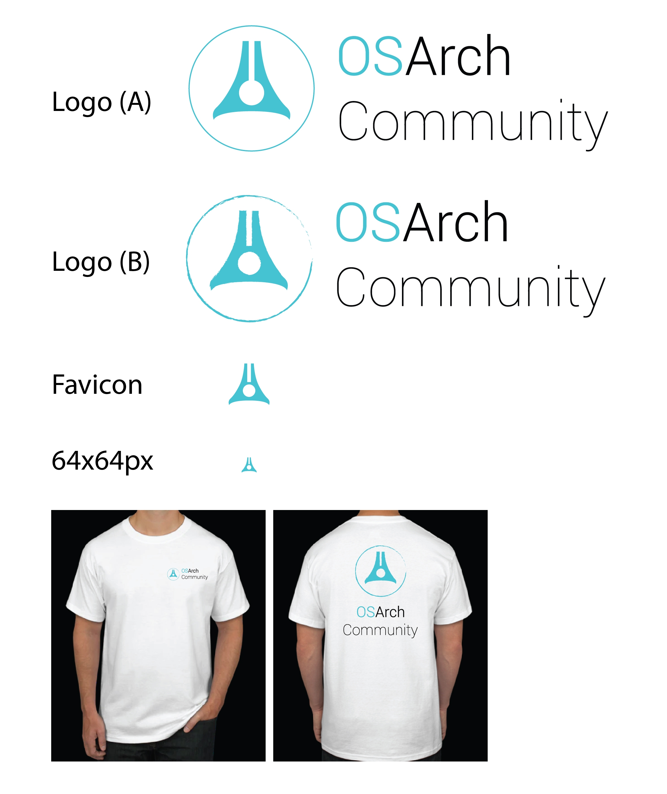
Wanted to see what it looks like on tee shirts for swag!
As a masthead for OSArch, this strikes me as carrying the imagery of a ship that's sailed, and is sailing, towards freedom....for the built environment! The simple play on geometry might be suggestive of how complex systems start from simple notions (shapes), in the AEC industry. The O, the S and the A, are all there as in the original this is derived from. The green colour (earth) or the blue colour (sky, water) may represent the environment that frames and supports the output of the AEC industry.
P.S.
No reason why both colours can't be on the logo:
@gokermu said:
Hi everyone,
When will the logo of the OSArch be revealed? We have some finalists but when will we choose the winner??
The idea was that we do a round of polishing of the finalists and then vote for the winner. We haven't set up a deadline yet, since we haven't received any polished variants until recently. I guess we could start a countdown of two weeks soon?
Hello Everyone,
I am new to this forum. After reading this discussion I was inspired to do a proposal that is a kind of mix between the finalists, based on the letters with the A representing a backbone, as OS Arch is building the blocks that will support the future development of new architecture...and please sorry if I am coming too late but I hope it helps, feel free to use it ! ...or erase it (I think I messed up with the board a bit)
@Moult said:
Sorry I've disappeared from the convo for a bit been busy. @JanF as you started this initiative, would you set some rules and a deadline to finalise?
The clock is still running, there are about four more days. (I'm sticking to the two weeks from the last submission)
I'll collect the designs and set up voting next week, the proposal with most votes wins.
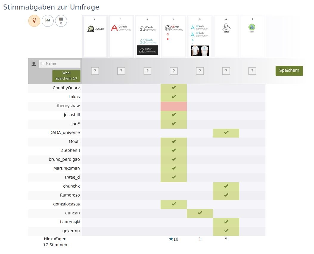
Ok, I know it was long, but I think it was worth the time. The final poll is up! https://framadate.org/aSnya7ThhVYSvzpP
I kept the three finalists from the first round that did not receive any update and added the four new modified versions.
Please choose JUST ONE design you believe represents the OSArch community the best. You have three weeks to add your vote, the poll will close on 2nd April. On the April Monthly Meetup we will announce the winner.
@JanF there seems to be some malfunctioning of the website. At first it was offering only the "X' option for each case. I somehow managed to cast my vote with no selection and when trying to modify it (I can then see all four options) it does not save my updated vote.
In any case I vote for #4.
@Jesusbill sorry about that, I think a set the poll up wrong. I corrected it and your vote as well. @lukas@theoryshaw can you please confirm your vote?
I nearly went with the flow but I really like the 'pen nib / futurist' logo so I chose honesty over conformity. But it looks like we're heading for a clear winner - that great!
@tetov could you give a shot at adding a favicon to all the OSArch sites (excl. learn.osarch as @SigmaDimensions can tackle that)? I assume it'll be based off the 64px version.
Comments
I think the finalists are good enough. Just pick one!
Added a variant / progression from JanF's take: https://dev.first-draft.xyz/d/s1dd2fl5al/?l=1919&t=69&r=3171&b=601&z=1.2
.....the svg file.
Hi everyone,
When will the logo of the OSArch be revealed? We have some finalists but when will we choose the winner??
Wanted to see what it looks like on tee shirts for swag!
As a masthead for OSArch, this strikes me as carrying the imagery of a ship that's sailed, and is sailing, towards freedom....for the built environment! The simple play on geometry might be suggestive of how complex systems start from simple notions (shapes), in the AEC industry. The O, the S and the A, are all there as in the original this is derived from. The green colour (earth) or the blue colour (sky, water) may represent the environment that frames and supports the output of the AEC industry.
P.S.
No reason why both colours can't be on the logo:
The idea was that we do a round of polishing of the finalists and then vote for the winner. We haven't set up a deadline yet, since we haven't received any polished variants until recently. I guess we could start a countdown of two weeks soon?
I try to combine the 1st and 2nd popular logos and made some modification

@chunchk I love the reference to the nib of a pen in logo a
So the countdown of two weeks since the last submission is running again here:
http://janfilipec.cz/OSArch/logo_countdown.html
You still have about ten days to submit your designs!
Hello Everyone,

I am new to this forum. After reading this discussion I was inspired to do a proposal that is a kind of mix between the finalists, based on the letters with the A representing a backbone, as OS Arch is building the blocks that will support the future development of new architecture...and please sorry if I am coming too late but I hope it helps, feel free to use it ! ...or erase it (I think I messed up with the board a bit)
Sorry I've disappeared from the convo for a bit been busy. @JanF as you started this initiative, would you set some rules and a deadline to finalise?
The clock is still running, there are about four more days. (I'm sticking to the two weeks from the last submission)
I'll collect the designs and set up voting next week, the proposal with most votes wins.
Looks like "i love Paris" somewhat like eiffel towerish.
Ok, I know it was long, but I think it was worth the time. The final poll is up!
https://framadate.org/aSnya7ThhVYSvzpP
I kept the three finalists from the first round that did not receive any update and added the four new modified versions.
Please choose JUST ONE design you believe represents the OSArch community the best. You have three weeks to add your vote, the poll will close on 2nd April. On the April Monthly Meetup we will announce the winner.
@lukas you marked only one as "no". That is completely fine, however, we will only count positive votes, so please add also a "yes" one somewhere.
@chunchk is that you who voted as Chun? Your vote will not be considered if you vote for more than one proposal.
@JanF there seems to be some malfunctioning of the website. At first it was offering only the "X' option for each case. I somehow managed to cast my vote with no selection and when trying to modify it (I can then see all four options) it does not save my updated vote.
In any case I vote for #4.
@Jesusbill sorry about that, I think a set the poll up wrong. I corrected it and your vote as well.
@lukas @theoryshaw can you please confirm your vote?
I did a mistake, and was not able to correct it..:-( , it was meant to be a 'yes'
I reckon we need a tie-breaker ;)
Oh 1 only? sorry I didn't see it
Please ignore the the Votes from Chun. I will vote again under the name of chunchk
I nearly went with the flow but I really like the 'pen nib / futurist' logo so I chose honesty over conformity. But it looks like we're heading for a clear winner - that great!
Ok the poll is closed, we have a winner!

I've added the a section about our identity to the Wiki:
https://wiki.osarch.org/index.php?title=Open-Source_Architecture_Community#Identity
very cool. nice work.
Looks awesome. Could you share the editable version of the logo? So i can add it to our YouTube channel.
Added the svg to the wiki
https://wiki.osarch.org/index.php?title=File:OSArch_logo.svg
You should change the GNU and OS initiative logos in the title.
@bitacovir better for now?
@tetov could you give a shot at adding a favicon to all the OSArch sites (excl. learn.osarch as @SigmaDimensions can tackle that)? I assume it'll be based off the 64px version.
@Moult Favicon and Apple's touch-icon scheme set for all pages now.
@SigmaDimensions: The multi-resolution favicon file can be found here.