

Standardising the "look and feel" aka "style guide"
I've pulled/plagiarized/copied some text from one of @Moult discussions topics away from the OSArch Website Design thread to give it more space here.
The idea is that we would benefit from standardising the "look and feel" of the Wiki, Community, and OSArch landing page. There are three aspects to this:
- A logo, repeated across all three sites
- A colourscheme, repeated across all three sites.
- A typeface, repeated across all three sites
@Moult current fonts: Open Sans for all headers, and Lato for all body text
We also need this consistent style for other things:
- Teaching content with fliers, slides, videos etc.
- Social media content
A color scheme should standardise background colours, text colours, link colours, button colours, across all pages. Doing this step is relatively easy and can do a lot for unification of the design. Do we want to continue with a light colour scheme, or do we want to swap to a dark theme?
Here is the community's current scheme: https://coolors.co/ffffff-22252c-e14658-555555-888384
Here is the wiki's current scheme: https://coolors.co/ffffff-555555-eaecf0-3366cc-8e36ae
Things to consider:
Links are extremely important in a Wiki. They should be clearly identifiable, with three distinct colours for regular links, visited links, and non-existant page links.
Pages may have lots of graphics, including screenshots of applications. How does this work with the colour scheme?
( @JanF this is the place for your logo ideas! )
Comments
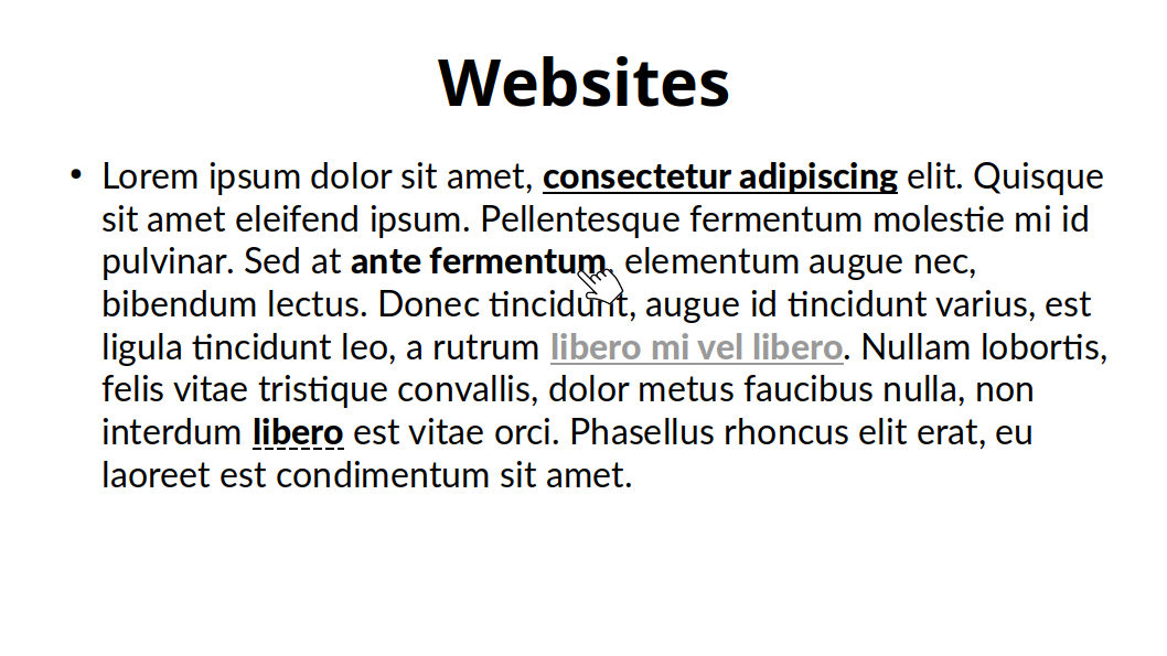
How about something like this for links. Look at the image before you read the description - does it make sense without reading my description?
Spoiler alert:
I've used Lato Heavy underlined for links with a random dark grey for visited links. Missing pages are dashed underline. Mouse over removes the underline. I'm sure I've seen this scheme somewhere, it seems logical to me.
Neither Open Sans nor Lato were installed on my system. Is that not a problem? Won't my browser just substitute?
In google fonts days should not be an issue at all, fonts are downloaded by the browser given proper css is setup (Moult may not want such things).
-pro: things are the same everywhere
-cons: load time and tracking
As far as i can tell, Arial or some kind of frutiger native font may look nearly the same ?
And yes, when not available, the browser does substitute with respect to a font list, eg: google-font, Arial, Helvetica, non-serif.
Your browser will substitute, but as @stephen_l says not to worry since I'm linking to the Google font repos. In the future I will self host the fonts so that we don't need this Google connection, which basically serves as one big tracking network.
Ok, so here goes my draft of the osarch.org homepage, to start the discussion.
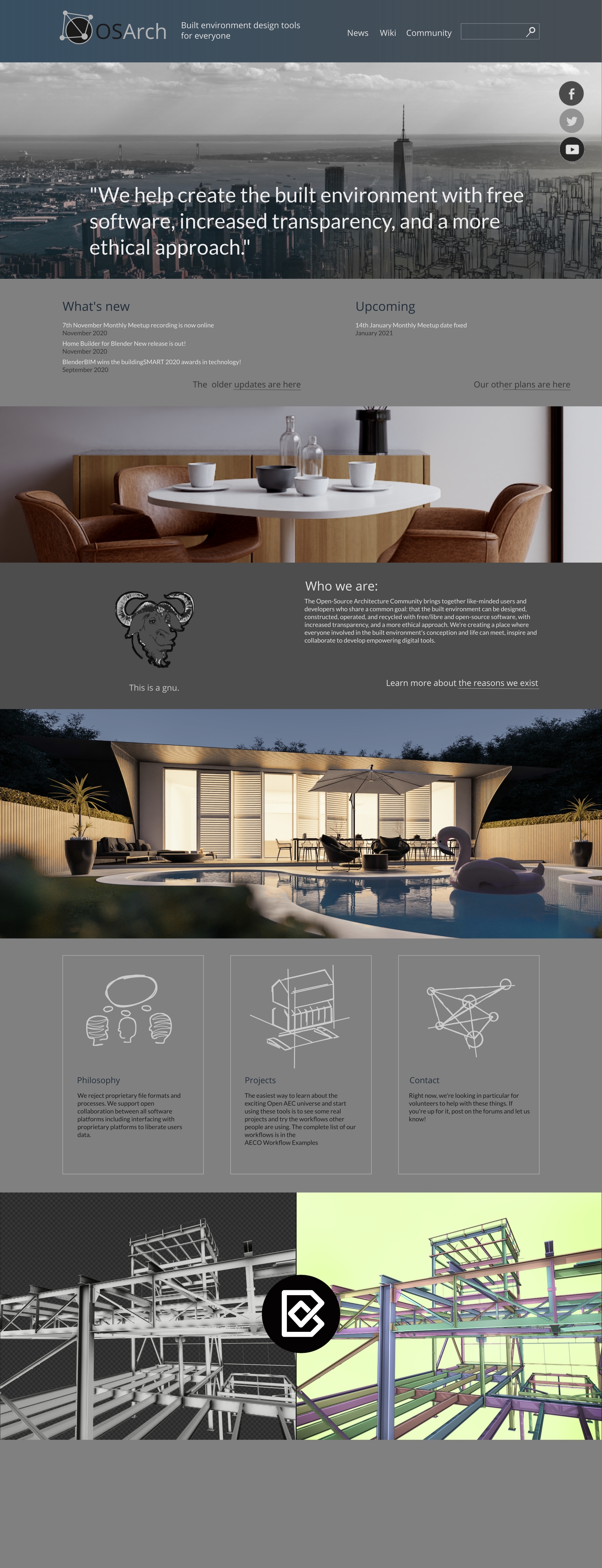
You can add notes and scribbles here: https://dev.first-draft.xyz/d/or7ia3v4l1
Or if someone likes to take it further, the original inkscape svg is attached.
The title image is from unsplash.com, the other two form luxcore gallery.
OSarch.org
Nice work. I say let's do it without the logo for now. I have some small comments on text and link targets. But let's save those until some others have commented on the overall look. I'd love some pictures from our projects, but looking good must be a priority for now.
Osarch logo
I'm happy to support that logo, but I think the logo deserves a dedicated discussion. Let's get talking about that - does it need it's own thread?
@JanF can you say something about how you arrived at the logo?
OSArch Wiki
I hope people think the wiki is looking good. I've suggested some changes to links, what do people think about them? The only problem with them is that they drain the page completely of color. So we need a color scheme to bring to other elements on the page before it would look good.
Great work @JanF! I do think though that the logo deserves its own thread, and at least a few options by a few people before we settle.
I'm a little concerned about content. I'm a strong believer in the layout being there to support content, whereas right now, apart from the news headers, the philosophy is repeated again and again throughout. Here's a list of content I think should exist somewhere on the site:
What do you guys reckon? Is it appropriate to make the main OSArch site to be primarily a news and events outlet? It seems like FOSS & AEC news is something that doesn't yet exist, and we can help provide that "go to" outlet.
I think the colour scheme could be a bit more exciting - it's very desaturated. I think we're a pretty funky bunch and it should reflect that ;)
I've scribbled all over it on first draft, hopefully it makes sense.
I started a topic and a first-draft for the logo, added also a short explanation for mine there.
What do you mean by "youtube" in the splash image and those "d"s scattered all over the place?
@JanF For inspiration you can take a look at https://www.osgeo.org/ I like the fresh white colors (positive mood!) and position of the content. In my opinion your proposal is to dark, also the black letters on grey background is not readable.
I am not a huge fan of dark themes myself, but it was propsed somewhere here on the forum also for environmental reasons and that is why I went with it.
Thanks for the feedback, I don't mind a bit lower contrast personally and I wanted to see what others say.
@JanF hehehe I think my browser as acting up and kept on spewing "d"s everywhere. I've deleted it!
@Meetlat I like the OSGeo page! Light and clean!
I noticed that comment. As I understand it that is nonsense unless you have an OLED screen, or e-paper reader - all LED screen have constant backlighting regardless of the screen color. That's why screen with high contrast costs more.
I like these proposals, the sketchy drawings are good, though I wonder about this one:
Since it is the GNU logo it implies that this is GNU sponsored software (the GNU project hosts and maintains various software projects). It is also a representation of Stallman himself - I'm sure we all love him for his delightful qualities, but this picture will be off-putting for many.
I'm sorry to get into the discussion, but I thought I would give my onw opinion on this.
I would go for a simpler look and overall approach. Streamline everything and throw the less info possible to users so the info you do throw is clear and concise. We cannot possibly read everything at once and that is the main issue with the wiki layout. I don't know what to focus on.
The website should avoid that if possible.
The Logo should undergo a similar process as Blenderbim's logo that turned out quite nice.
Here's a quick doodle on the Layout using JanF's base. New SVG attached.
Maybe we don't need the GNU on this page. It is other places.
On this front page maybe just repeating the OSArch logo is fine beside the "who we are" text?
What are peoples thoughts on color? I think we need to introduce a consistent element of color. Was it @JanF who had a suggestion in another thread? The one where @Jesusbill was sad about us not liking his swamp-monster green. I can't find it.
What about my suggestion for links on the wiki. I think text should be plain, headings, borders, backgrounds and images introduce color.
We can swap out the Gnu logo with the OSI logo instead? Looking at Wikipedia, they use the Gnu to denote free software, without implying it is part of the GNU project:
@Moult this is at the core of our discussion the other day about licenses which I won't bore this thread with.
I don't think our front page needs to get into the woods about licenses. Let's just avoid the issue for the front page. I for one would be unhappy to have the OSI icon and not the GNU. SO let's just drop it. The front page is not the best place for raising these issues.
I had a shot at designing the OSArch site! (note: logo is just a placeholder of course - pending the results of the logo design)
GIMP XCF file is here: https://gitlab.com/dionmoult/tmp-osarchorg
@Moult I like it! Clean, fresh and playful with the arch. Perhaps adding some language flag somewhere, so users can change the language? Next to the YouTube logo or search bar at the top? And what about upcoming events? Below the Subscribe part? Also I can see you added ARCH/ESD/ELEC buttons below the article. Are those Tags? Perhaps adding a tags cloud somewhere, like this forum has.
@Meetlat completely agree with having a language option around the social media icons, and adding upcoming events below the subscribe portion.
Those are tags, yes, but the idea is to keep them limited to disciplines. That way someone can easily find what's relevant to them. For example a mechanical engineer may not be interested in news about architectural rendering features. There needs to be a "browse by discipline" link somewhere.
It is very pretty, but I'd like it to be graphically further away from the osgeo.org site. They also have pretty much exactly the same inage there which I think works great for them, but will be confusing for people expecting architecture from Open source architecture web.
From the latest sites I've visited lately the one I think would relate more to how OSArch should be explained is
https://www.ladybug.tools/
I don't mean graphically but in how it simply explains what it is and how it connects to/with existing software. A connection map like what they have there could make sense in OSArch too and it could derive from a collaborative mindmap.
I like the "nature" approach and the idea of moving way from the "tech" look. But I agree with @JanF, I guess is too nature and it might confuse new visitors. Maybe there is middle ground?
I really liked how the logo looks in this context
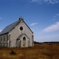
@JanF and @bruno_perdigao can I propose a different solution: not to fix a single header image? The built environment is large. It covers small residential buildings to skycrapers, to regenerative design, heritage preservation, disaster relief, urban planning, transport and infrastructure, the artistic, homely, to the corporate and modularised, and so on. I propose we have many images that are randomised and reflect the diverse disciplines and nature of our industry.
Here are a few images I collected to help reflect a bit of this. We can change / collect more as time goes on.
A little oriental, a little organic ....
... a little traditional, a little human scale ...
... a little urban, the stereotypical skyscrapers ...
... a little community, a little humanitarian ...
... a little historic, a little cultural ...
... and it never ends ... :)
Thoughts? Should we also set an arbitrary 2 week with no changes deadline to move ahead and start building this news homepage? Just so that we have a target to move towards? We can always refine it over time, just as how the Wiki and forums have evolved over time.
@JQL right now, I think it is more powerful to the industry to make the homepage centered on news articles. Can you try and create a mock-up of how you think we can explain OSArch better here? https://wiki.osarch.org/index.php?title=Open-Source_Architecture_Community
@Moult looks cool. Do you think we can manage a vote once a month on a new photo from community submissions? Perhaps together with the meetup, we announce the winner and the new vote for the next month? We could of course later do projects as well, but for starters I think photos should be enough. (Of course only your own, but I think we all have plenty of similar photos from holidays and so)
@JanF that sounds like a fun activity! You should totally lead it! We can also have a gallery of photos and the thoughts behind them :)
That's great! I guess we would have to use neutral colors so it can work with different images. Did you try anything?
@bruno_perdigao yes, I think for this to work the logo would have to be shown in monochrome or silhouette (white silhouette, in the case of the design I've shown) to ensure that it consistently works with different images.
Well we can simply add some css filters to have a similar feel to all of them, for example I kind of like this:
.filter {
position: relative;
-webkit-filter: contrast(120%) brightness(110%) sepia(20%) grayscale(10%);
filter: contrast(120%) brightness(110%) sepia(20%) grayscale(10%);
}
.filter::before {
content: "";
display: block;
height: 100%;
width: 100%;
top: 0;
left: 0;
position: absolute;
pointer-events: none;
mix-blend-mode: color;
opacity: 0.5;
background: -webkit-linear-gradient(to top, rgba(128, 98, 15, 1) 1, rgba(0, 59, 24, 0.53));
background: linear-gradient(to top, rgba(128, 98, 15, 1) 1, rgba(0, 59, 24, 0.53));
}
(generated by https://www.cssfilters.co/ I unfortunately didn't find out how to share the settings on that site)