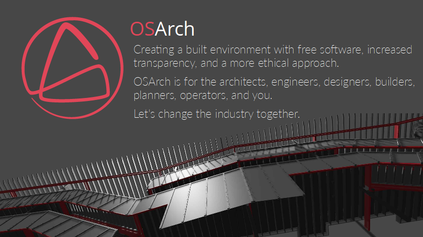
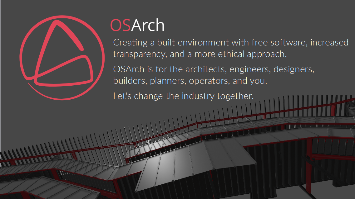
OSArch.org is all about "Creating a built environment with free software, increased transparency, and a more ethical approach. OSArch is for the architects, engineers, designers, builders, planners, operators, and you. Let's change the industry together."
So there are a ton of projects we are involved in which all need UX love. This job is about OSArch as an organization getting our own brand together.
Quite a few of us have design educations, there is a bunch of architects & different types of engineers all with a decidedly tech angle.
We've done some work on an OSArch logo on got a good result if you ask me. Variants of the logo are on the intro page.
Now we need to take this logo, be more specific about its use, and find out what it means for our general style.
We've had some general discussion before about the look and feel of our website which led to some good things. Focus then moved to the logo.
This is a not a weekend project, we're looking for someone, or a small group of people, to help us collect our ideas and make a concrete proposal. We have opinions about design, some of us spent years in design educations, but hopefully we also have also enough humility to be guided. Like I said this is not a weekend project, it's gonna be a process and there's no massive hurry.
About the money - we don't have any. But if you have an account on LiberaPay / Patreon or whatever we can work together to get some sponsorship. We support design as a paid profession, but we're not a legal organization yet, so we can't pay bills.
Deliverables
Facilitation and guidance on making a Style Guide (or whatever it should be called) that we can keep referring to and updating as we bring new projects online. It would include things like:
logo (the curve design is fixed but we're still discussing the implementation of colors/background etc)
color scheme (the red of the logo is one color)
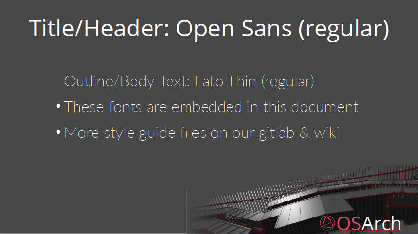
fonts (we have Open Sans for all headers, and Lato for all body text)
usability guidance
Examples for website/SoMe/forum/wiki/print/video/newsletter
The post is avaiting approval. Of course the work should be as accessible as possible. A wiki is not suitable for all types of files and for showcasing all types of design aspects. So I expect we'd end up with a variety of files types for different purposes. OpenDocument files, SVG, XCF (GIMP), Scribus files etc.
What I'm thinking of here is quite different in scope to what FreeCAD has. The FreeCAD page is about icon design. To be honest their branding in general is not as impressive as their community - but they have a product, so that's what gets focus. We have no product so our branding needs to be spot-on and easily recognizable. We're selling an idea not a product so that's a different kind of thing. We need a branding people can use for internal promotion at work, for presentations to groups, for coursework, for our different online services and so on. Everything needs to fit together.
The harsh reality for me is that if we can't impress Architecture student then we have a problem. If we have something that impresses them then most other parts of AEC should be on board. Hopefully someone from OSD can challenge some of these ideas and make them better and more relevant to our project.
@duncan said:
To be honest their branding in general is not as impressive as their community - but they have a product, so that's what gets focus.
Graphic design has not been a priority in the FreeCAD project. And artists are not big fans and users of this kind of software, either. Anyway, I agree with you about a good image is needed to communicate ideas and concepts. But keep in mind that as FLOSS project, even this branding design could take some time and several collaborators to be completed, because there is no money, at the moment.
@bitacovir said:
branding design could take some time and several collaborators to be completed, because there is no money, at the moment.
Maybe. But we could also just agree that a small groups comes with a proposal in several rounds to accept suggestions and then we vote to accept the design or not. I have a groups of three or four names I'd be happy to leave ti to. I'm hoping this process is what someone from the graphics design / UX community would be good at facilitating. We'll see what happens.
Hi folks,
This looks an interesting challenge and would love to join the discussion on this.
I'm new around here and liked what I read about the project. I also have a background in architecture and currently working in a web development oriented role.
We have a similar effort ongoing at our workplace and it resonated with me when I saw the the posting on Open Source Design jobs board. Can't quite say I have expertise to address this specific challenge but would love to contribute what I can.
Hi @amitlzkpa nice to see you here. Sorry I've been so busy. Let's see where this goes, I don't have time to keep momentum just now, maybe someone else will step up so we can agree on some framework for making these design decisions.
Design a process for trying out some different colors and fonts (there are some old suggestions earlier in this thread). Think website, slides, folders, letters, badges, stickers, swag ... something that works for them all.
From there we can look at how to implement them in our current online presence. Maybe we'll lose the zink roof and the seagulls along the way?
I tried starting off things in a way that I am familiar with (sort of) and putting together things I gathered from different threads. (The first-draft.xyz links didn't open for me so I have missed discussions from that channel).
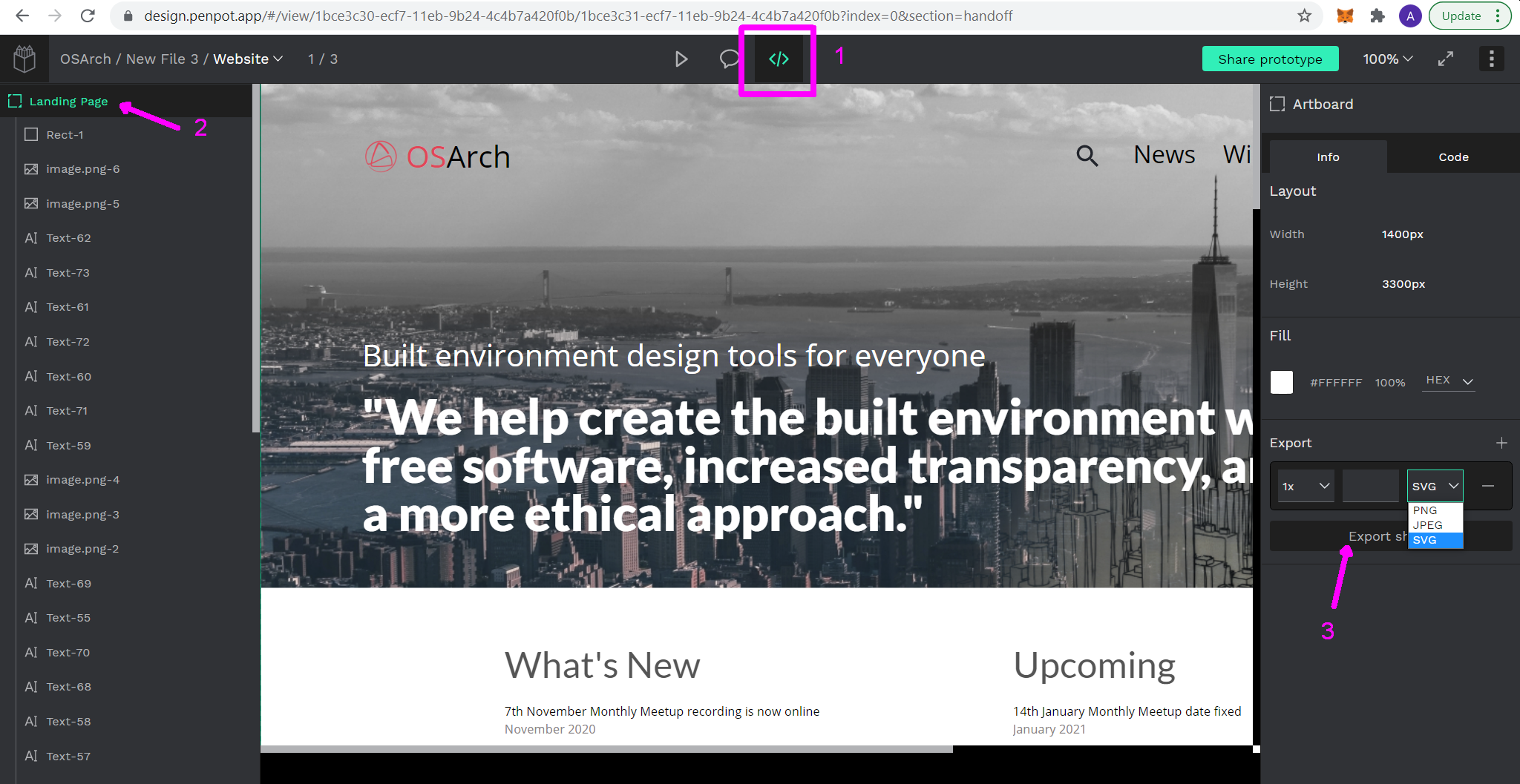
Wanted to get some quick feedback on it. Mainly to avoid redoing/duplicating things if they've already been attended to. https://design.penpot.app/#/view/1bce3c30-ecf7-11eb-9b24-4c4b7a420f0b/1bce3c31-ecf7-11eb-9b24-4c4b7a420f0b?token=Fp59pNrTmccEl8DzDq06uA&index=0
Would appreciate any comments on this. It isn't much - but if it looks like it's going the right direction (or not) please let me know.
I was thinking of mocking up the different front-page designs I found on the threads in a similar format.
Looking good. The first-draft.xyz page has graphical examples from our process. I find I often have to visit the link more than once before it opens correctly.
We need to find an easily sharable format. I didn't see any way to download in an open format, is that functionality there? Maybe penpot doesn't support that?
Some quick mockups for front pages would be great. Of course it might not be possible to implement totally as wished but is always a good exercise. Maybe also a mockup for a slide presentation and the front page of a newsletter / flier.
@duncan Penpot Share Link
Penpot has an option to let you download the files as png/svg/pdf. Please use the URL above and have a look at the image below to try that.
The first-draft.xyz pages did not load for me after multiple attempts at refreshing in Chrome and Firefox. (I can see an error log in the console when I load the page).
I could also share the project with anyone who wants to access the editing workspace for this project on Penpot. Please let me know your email.
I would be curious to hear about your opinions about Penpot. They are an OS alternative to Figma, Adobe XD etc. and have been pretty active with us at Open Source Design. It's still in alpha so I see rough edges here and there. But I thought this was a good opportunity to try out something like that. If we feel it's not working as we need I'd be happy to switch to any other medium.
I've reorganized the file to move the colour palette, typography and the front page mockup to different "pages" within penpot.
This makes it easier for making clickable mockup. (Try clicking on 'What's New' and 'Upcoming' on the website mockup).
For using consistent icons across all media I started with material icons.
Please have a look at the links below: Colour Palette Typography Website Assets
The website mockup is the first light themed mockup adjusted to work with the styling discussion and new logos I found across the thread.
Planning to do the curvy masked mockups next and then move to slides, presentation etc. This has been a good way for me to learn more about the project.
Please share your thoughts :) .
My first comment is that penpot doesn't work very well on phone screens ? so I'll add my comments tomorrow when I open it on a computer.
Did anyone manage to load the first draft pages? To me it seems like they fot erased for some reason.
hey @amitlzkpa ,
Thanks for sharing what you have done, great job. I would like to make a few points:
I couldn't quite warm up to the colors of our logo. If you can try different color alternatives, It would be great (if this matter has not been closed ). Because the colors of the logo will actually influence the color palette of the entire identity.
There are some problems with the proportions. Texts and icons in the header are way too big (or normal text size is small.)
There are alignment issues. Slider text and headings, normal texts do not align.
Instead of creating the entire homepage, I think you can start small. Maybe start with logo and colors. Thank you?!!
@gokermu said:
hey @amitlzkpa ,
....
Instead of creating the entire homepage, I think you can start small. Maybe start with logo and colors. Thank you?!!
Well he did some work on the mock-up I created. But I thought we simply dropped it when Dion made the new website and if we wanted to progress, we should propose changes to the online version at OSArch.org.
Colour Palette
* The Secondary color palette doesn't match the rest. I'm not sure what the intended use is, but I would suggest:
* #C97754/#EBBA53/#EEDD87
Typography
* I'd show just the sizes and styles we use (drop italics almost everywhere, bold only for emphasis in paragraph?)
* What's the difference between body and paragraphs? Website
* see above Assets
* What is this supposed to be?
Why can't I change anything there? Do I need permission or something? Also why can't I browse the directory?
Some thoughts and replies: Colours
I was referring to the first post on this thread where a colour scheme was put forth. The new colour scheme also looks very promising. Before exploring more options for those I wanted to check if there are there any guidelines on what basis the schemes are determined/preferred? Logo
Logo seems to have been decided on this thread by vote. I think @gokermu is right in suggesting we fix the logo first before picking a color scheme. In some cases I've also worked with logos which don't have a fixed colour scheme but designed to be flexible to be adapted in different ways. I don't suppose we are trying to do something like that here. Font
I agree on the apparent dissonance with font sizing. Thanks for pointing that out. I'll rework that. I read Lato and Open Sans being picked as the final fonts for the typography scheme. Please let me know if that is final or that is also being considered to be changed. Grids and Alignment for Main Page
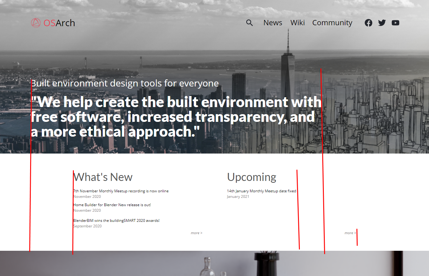
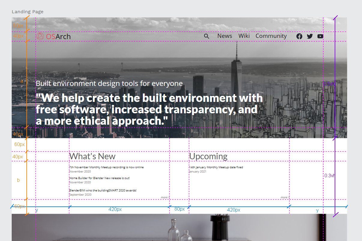
These were the gridlines and offsets/buffers I was trying to align to. The letters are indicative for responsive sizing.
The alignment guides line up to the containers which hold text instead of the text themselves. (I believe for things like "What's New" and "Upcoming" the text would be dynamic which won't be suitable for alignment anchors).
For offsets and sizing I was trying to be in multiples of 20px depending on the size of the content it is used around.
Hopefully rules/guidelines like these would be reusable across templates and formats for other media as well (slides, flyers etc.)
Text and linebreaks
With text I believe it's important to have an idea of maximum number of words in a line. This depends on the font size and spacing around, but loosely speaking with large sized text (like the tagline above) it's good around to have a maximum of 6-10 words and physical width of 6-8".
With more dense paragraph like text it's good with max of 10-15 words in a line and 3-4" wide.
There are outliers for this, but few enough that they can be considered special cases. It might break symmetry at some places, but that is what we get for LTR writing systems I guess. Would like to hear your thoughts.
@JanF Here's the page with sizes and styles. Same as the one above for Typography. Is that what you meant?
Assets are the repeated graphic elements we might use. (eg: icons for social media, directional arrows, menu icons, icons for arch software like Revit or Rhino or something, any custom icon we design etc.) Main purpose is to avoid having to lookup which icons or assets to use when creating new content based on this system. Also nice to use the same visual elements for consistency.
While we don't have to use all text styles on the website, if we are talking about a general design system I think it's worth it to have font-decoration (bolds, italics etc) be part of it. They might be usable in other contexts and if/when we use it there, it'd still be consistent with the overall visual identity.
Can you DM your email address and I can add you as a collaborator to be able to edit.
Thank you both for the comments and replies :) !
What do you think might be a good next step? I'm still getting familiar with things but much better than before.
I'd like to add some thoughts. I'm not a graphic or website designer.
I don't feel like what we need is to get deep into the details of pixel placement of blocks of text, columns etc. I feel like what we need is some quick mockups of how a design scheme can work in many different situations: homepage, wiki, forum, brochure, presentations, documentation and so on.
Colours (nice to be using the queens spelling again for a moment)
I'd be interested to see how some more colours could be used.
Logo @amitlzkpa it is correct that the logo is fixed. There is however a little room to move
1. the shade of red color of the logo seems to have broad support, so I don't see that changing
2. the use of color(s) in the logo i maybe a discussion, like foreground / background, dark / light background. The only two options that I think work are black on white or red on white. (We tried red on black and it looks super cool. but it also looks like an anarchy symbol)
My personal take is that a logo has a color and that color is one of the main colors in the theme. I also feel that the linework of our logo is so thin that we need to control the background color. In the post before this the eye is absolutely drawn to the "OS" next to the logo. That's a problem, The logo should be at least as eye catching as the text. I think we need to keep a white background for that to be possible.
Font
I've not heard any objections to Lato, although isn't there a problem that it's not installed on most systems? Currently for the webpage I believe we are relying on some google magic to fix this. But for presentations we send to people ...
Thanks for the input.
I am working on a draft to bring the colours, fonts and other elements in the same view to try out how they feel.
It's been a busy few weeks and will post the update soon. Thanks!
I've been meaning for ages to make a presentation template. Please take a look at the attached LibreOffice Impress 'template' and let me know what you think.
First slide:
Template slide:
Closing slide:
Edit: deleted the old attachment
Perfect @theoryshaw , thanks.
I'm a bit unsure about that Lato Thin. It's nice, but probably not easy to read from a projector on a screen at a distance. I'm thinking lecture halls & conference centres.
@duncan said:
Perfect @theoryshaw , thanks.
I'm a bit unsure about that Lato Thin. It's nice, but probably not easy to read from a projector on a screen at a distance. I'm thinking lecture halls & conference centres.
It was the first thing I thought when I saw it, is there a bold version @duncan ? You are on the money it will be hard to read, everything else is great though!
@Ace@theoryshaw here's Lato Light instead of Lato Thin. Better right? But good enough? We have a large projector over at the dining hall. I'll try and test it some time.
The template now has some more styles and the earlier defined accent colors. There is also a master slide, I've been meaning for years to learn how they work.
Edit: deleted the old attachment


Comments
@JanF yes, and a slight opacity / black overlay tweak can ensure readability.
Bringing this thread to life again. If you're new to this thread then remember also the thread hunt-for-the-new-osarch-org-logo
I've got a posting ready for https://opensourcedesign.net/jobs/job-form/
Comments?
Project: Style Guide advice for OSArch.org
OSArch.org is all about "Creating a built environment with free software, increased transparency, and a more ethical approach. OSArch is for the architects, engineers, designers, builders, planners, operators, and you. Let's change the industry together."
So there are a ton of projects we are involved in which all need UX love. This job is about OSArch as an organization getting our own brand together.
Quite a few of us have design educations, there is a bunch of architects & different types of engineers all with a decidedly tech angle.
Here's how far we are now:
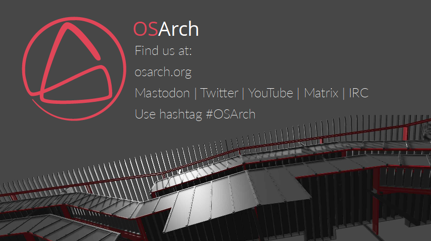
https://osarch.org is looking presentable
https://wiki.osarch.org/ is okay but suffers from a lack of design cohesion
https://community.osarch.org/ is also okay but also doesn't connect very well with any specific style.
https://learn.osarch.org/ is kind of doing it's own thing. Again, without a Style Guide it's hard to know where to start.
We've done some work on an OSArch logo on got a good result if you ask me. Variants of the logo are on the intro page.
Now we need to take this logo, be more specific about its use, and find out what it means for our general style.
We've had some general discussion before about the look and feel of our website which led to some good things. Focus then moved to the logo.
This is a not a weekend project, we're looking for someone, or a small group of people, to help us collect our ideas and make a concrete proposal. We have opinions about design, some of us spent years in design educations, but hopefully we also have also enough humility to be guided. Like I said this is not a weekend project, it's gonna be a process and there's no massive hurry.
About the money - we don't have any. But if you have an account on LiberaPay / Patreon or whatever we can work together to get some sponsorship. We support design as a paid profession, but we're not a legal organization yet, so we can't pay bills.
Deliverables
Facilitation and guidance on making a Style Guide (or whatever it should be called) that we can keep referring to and updating as we bring new projects online. It would include things like:
I think this "Style Guide" could remain in a format of wiki like https://wiki.freecadweb.org/Artwork_Guidelines.
The post is avaiting approval. Of course the work should be as accessible as possible. A wiki is not suitable for all types of files and for showcasing all types of design aspects. So I expect we'd end up with a variety of files types for different purposes. OpenDocument files, SVG, XCF (GIMP), Scribus files etc.
What I'm thinking of here is quite different in scope to what FreeCAD has. The FreeCAD page is about icon design. To be honest their branding in general is not as impressive as their community - but they have a product, so that's what gets focus. We have no product so our branding needs to be spot-on and easily recognizable. We're selling an idea not a product so that's a different kind of thing. We need a branding people can use for internal promotion at work, for presentations to groups, for coursework, for our different online services and so on. Everything needs to fit together.
The harsh reality for me is that if we can't impress Architecture student then we have a problem. If we have something that impresses them then most other parts of AEC should be on board. Hopefully someone from OSD can challenge some of these ideas and make them better and more relevant to our project.
Graphic design has not been a priority in the FreeCAD project. And artists are not big fans and users of this kind of software, either. Anyway, I agree with you about a good image is needed to communicate ideas and concepts. But keep in mind that as FLOSS project, even this branding design could take some time and several collaborators to be completed, because there is no money, at the moment.
Maybe. But we could also just agree that a small groups comes with a proposal in several rounds to accept suggestions and then we vote to accept the design or not. I have a groups of three or four names I'd be happy to leave ti to. I'm hoping this process is what someone from the graphics design / UX community would be good at facilitating. We'll see what happens.
Hi folks,
This looks an interesting challenge and would love to join the discussion on this.
I'm new around here and liked what I read about the project. I also have a background in architecture and currently working in a web development oriented role.
We have a similar effort ongoing at our workplace and it resonated with me when I saw the the posting on Open Source Design jobs board. Can't quite say I have expertise to address this specific challenge but would love to contribute what I can.
Hi @amitlzkpa nice to see you here. Sorry I've been so busy. Let's see where this goes, I don't have time to keep momentum just now, maybe someone else will step up so we can agree on some framework for making these design decisions.
My suggested priorities
@amitlzkpa would you like to help create some new designs related to @duncan 's suggestions?
@Moult
Yes. That sounds great.
I'll carve out some time this week to start work on it and will post updates here.
Thanks for the prompt!
I tried starting off things in a way that I am familiar with (sort of) and putting together things I gathered from different threads. (The first-draft.xyz links didn't open for me so I have missed discussions from that channel).
Wanted to get some quick feedback on it. Mainly to avoid redoing/duplicating things if they've already been attended to.
https://design.penpot.app/#/view/1bce3c30-ecf7-11eb-9b24-4c4b7a420f0b/1bce3c31-ecf7-11eb-9b24-4c4b7a420f0b?token=Fp59pNrTmccEl8DzDq06uA&index=0
Would appreciate any comments on this. It isn't much - but if it looks like it's going the right direction (or not) please let me know.
I was thinking of mocking up the different front-page designs I found on the threads in a similar format.
Looking good. The first-draft.xyz page has graphical examples from our process. I find I often have to visit the link more than once before it opens correctly.
We need to find an easily sharable format. I didn't see any way to download in an open format, is that functionality there? Maybe penpot doesn't support that?
Some quick mockups for front pages would be great. Of course it might not be possible to implement totally as wished but is always a good exercise. Maybe also a mockup for a slide presentation and the front page of a newsletter / flier.
@gokermu & @JanF your input would be very welcome here. You both have important grasp of our visual identity.
@duncan
Penpot Share Link
Penpot has an option to let you download the files as png/svg/pdf. Please use the URL above and have a look at the image below to try that.
The first-draft.xyz pages did not load for me after multiple attempts at refreshing in Chrome and Firefox. (I can see an error log in the console when I load the page).
I could also share the project with anyone who wants to access the editing workspace for this project on Penpot. Please let me know your email.
I would be curious to hear about your opinions about Penpot. They are an OS alternative to Figma, Adobe XD etc. and have been pretty active with us at Open Source Design. It's still in alpha so I see rough edges here and there. But I thought this was a good opportunity to try out something like that. If we feel it's not working as we need I'd be happy to switch to any other medium.
I've reorganized the file to move the colour palette, typography and the front page mockup to different "pages" within penpot.
This makes it easier for making clickable mockup. (Try clicking on 'What's New' and 'Upcoming' on the website mockup).
For using consistent icons across all media I started with material icons.
Please have a look at the links below:
Colour Palette
Typography
Website
Assets
The website mockup is the first light themed mockup adjusted to work with the styling discussion and new logos I found across the thread.
Planning to do the curvy masked mockups next and then move to slides, presentation etc. This has been a good way for me to learn more about the project.
Please share your thoughts :) .
My first comment is that penpot doesn't work very well on phone screens ? so I'll add my comments tomorrow when I open it on a computer.
Did anyone manage to load the first draft pages? To me it seems like they fot erased for some reason.
Just saw this. Will take a look at it asap
hey @amitlzkpa ,
Thanks for sharing what you have done, great job. I would like to make a few points:
There are some problems with the proportions. Texts and icons in the header are way too big (or normal text size is small.)
There are alignment issues. Slider text and headings, normal texts do not align.
Instead of creating the entire homepage, I think you can start small. Maybe start with logo and colors. Thank you?!!
Well he did some work on the mock-up I created. But I thought we simply dropped it when Dion made the new website and if we wanted to progress, we should propose changes to the online version at OSArch.org.
Colour Palette
* The Secondary color palette doesn't match the rest. I'm not sure what the intended use is, but I would suggest:
* #C97754/#EBBA53/#EEDD87
Typography
* I'd show just the sizes and styles we use (drop italics almost everywhere, bold only for emphasis in paragraph?)
* What's the difference between body and paragraphs?
Website
* see above
Assets
* What is this supposed to be?
Why can't I change anything there? Do I need permission or something? Also why can't I browse the directory?
Some thoughts and replies:
Colours
I was referring to the first post on this thread where a colour scheme was put forth. The new colour scheme also looks very promising. Before exploring more options for those I wanted to check if there are there any guidelines on what basis the schemes are determined/preferred?
Logo
Logo seems to have been decided on this thread by vote. I think @gokermu is right in suggesting we fix the logo first before picking a color scheme. In some cases I've also worked with logos which don't have a fixed colour scheme but designed to be flexible to be adapted in different ways. I don't suppose we are trying to do something like that here.
Font
I agree on the apparent dissonance with font sizing. Thanks for pointing that out. I'll rework that. I read Lato and Open Sans being picked as the final fonts for the typography scheme. Please let me know if that is final or that is also being considered to be changed.
Grids and Alignment for Main Page
These were the gridlines and offsets/buffers I was trying to align to. The letters are indicative for responsive sizing.
The alignment guides line up to the containers which hold text instead of the text themselves. (I believe for things like "What's New" and "Upcoming" the text would be dynamic which won't be suitable for alignment anchors).
For offsets and sizing I was trying to be in multiples of 20px depending on the size of the content it is used around.
Hopefully rules/guidelines like these would be reusable across templates and formats for other media as well (slides, flyers etc.)
Text and linebreaks
With text I believe it's important to have an idea of maximum number of words in a line. This depends on the font size and spacing around, but loosely speaking with large sized text (like the tagline above) it's good around to have a maximum of 6-10 words and physical width of 6-8".
With more dense paragraph like text it's good with max of 10-15 words in a line and 3-4" wide.
There are outliers for this, but few enough that they can be considered special cases. It might break symmetry at some places, but that is what we get for LTR writing systems I guess. Would like to hear your thoughts.
@JanF
Here's the page with sizes and styles. Same as the one above for Typography. Is that what you meant?
Assets are the repeated graphic elements we might use. (eg: icons for social media, directional arrows, menu icons, icons for arch software like Revit or Rhino or something, any custom icon we design etc.) Main purpose is to avoid having to lookup which icons or assets to use when creating new content based on this system. Also nice to use the same visual elements for consistency.
While we don't have to use all text styles on the website, if we are talking about a general design system I think it's worth it to have font-decoration (bolds, italics etc) be part of it. They might be usable in other contexts and if/when we use it there, it'd still be consistent with the overall visual identity.
Can you DM your email address and I can add you as a collaborator to be able to edit.
Thank you both for the comments and replies :) !
What do you think might be a good next step? I'm still getting familiar with things but much better than before.
I'd like to add some thoughts. I'm not a graphic or website designer.
I don't feel like what we need is to get deep into the details of pixel placement of blocks of text, columns etc. I feel like what we need is some quick mockups of how a design scheme can work in many different situations: homepage, wiki, forum, brochure, presentations, documentation and so on.
Colours (nice to be using the queens spelling again for a moment)
I'd be interested to see how some more colours could be used.
Logo
@amitlzkpa it is correct that the logo is fixed. There is however a little room to move
1. the shade of red color of the logo seems to have broad support, so I don't see that changing
2. the use of color(s) in the logo i maybe a discussion, like foreground / background, dark / light background. The only two options that I think work are black on white or red on white. (We tried red on black and it looks super cool. but it also looks like an anarchy symbol)
My personal take is that a logo has a color and that color is one of the main colors in the theme. I also feel that the linework of our logo is so thin that we need to control the background color. In the post before this the eye is absolutely drawn to the "OS" next to the logo. That's a problem, The logo should be at least as eye catching as the text. I think we need to keep a white background for that to be possible.
Font
I've not heard any objections to Lato, although isn't there a problem that it's not installed on most systems? Currently for the webpage I believe we are relying on some google magic to fix this. But for presentations we send to people ...
Great work happening here!
Thanks for the input.
I am working on a draft to bring the colours, fonts and other elements in the same view to try out how they feel.
It's been a busy few weeks and will post the update soon. Thanks!
I've been meaning for ages to make a presentation template. Please take a look at the attached LibreOffice Impress 'template' and let me know what you think.
First slide:
Template slide:
Closing slide:
Edit: deleted the old attachment
Looks good. I just added a banner png, with a transparent background.. might be helpful.
https://gitlab.com/osarch/OSArch/-/blob/87f8978b51989dda0f6af9f5db8975d44a43c936/Marketing/Banner/banner_with_transparent_background.png
Perfect @theoryshaw , thanks.
I'm a bit unsure about that Lato Thin. It's nice, but probably not easy to read from a projector on a screen at a distance. I'm thinking lecture halls & conference centres.
It was the first thing I thought when I saw it, is there a bold version @duncan ? You are on the money it will be hard to read, everything else is great though!
@Ace @theoryshaw here's Lato Light instead of Lato Thin. Better right? But good enough? We have a large projector over at the dining hall. I'll try and test it some time.
The template now has some more styles and the earlier defined accent colors. There is also a master slide, I've been meaning for years to learn how they work.
Edit: deleted the old attachment
Looking good @duncan way more legible
small improvements. i've also renamed this to make clear it is for screen use. next template is for print.
@duncan Nice, would suggest putting that file in our git repo?
Perhaps make a new folder, in this folder: https://gitlab.com/osarch/OSArch/-/tree/main/Marketing