

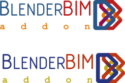
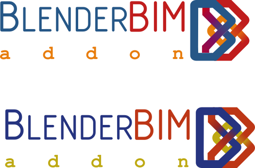
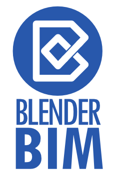
BlenderBIM logo design

Hi all,
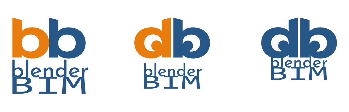
From a longer conversation about the graphic design and user-friendliness in open-source software that I had with @Moult, came the idea to redesign BlenderBIM logo. And as is the case with other ideas you may have in the open-source world, the response was: why don't you do it yourself? I'm not great with graphic design myself but I thought I give it a go and attached are some of my attempts which is basically mixing two Bs together B in Blender and B in BIM.
@Moult had the idea to share it with the community to let users decide, which I thought is a great idea. Open-sourcing the design process..
So please comment below and tell us what you think? Have a better idea? Design and post it in the thread.
Thanks!
PS: The software used for designing these is Inkscape, free and open-source.


Comments
E3
Other options if it is allowed:
Colors and b typo are from Blender logo...
Colors of O5, outline of E3 or E5
B2 or E3
@bitacovir everybody is welcome to join in :) I like the idea that you've thought of a typeface too. @hzamani any thoughts on adding a typeface?
Here another variation:
I like the other proposals but I had an idea and it is hard not to let it become something.

The mixture of colors represents the integration of blender with bim
(https://community.osarch.org/uploads/editor/8z/ro43qvj89biu.png "")
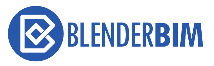
Of the designs, I prefer Baswein's proposal but it does seem to lean strongly on the buildingSmart logo (too strongly?).
Please note also Blender protects it's brand name and recommends excluding the Blender name from forks and related services (last paragraph in below link):
Usage of the name ‘Blender’, trademark and brand.
... "Although the name ‘Blender’ is a generic word (for a mixer), in the context of products or company names related to software it’s protected by trademark law."
...
In short – if you want to start a company or website related to Blender services, avoid using the name Blender in it. You can use it as a secondary tagline though – such as “Awesome Company Inc., the Blender specialists”. Same goes for forks of the Blender software, give it a new name and create a unique brand that way. The latter is also enforced by the GNU GPL, which explicitly excludes brand names from the freedom.
Some exceptions might apply, for example for free accessible community sites or websites that already exist for many years. For advice, do not hesitate to contact us.
...
https://blender.org/about/logo/
So, BlenderBIM should change the name... before to think in a logo...
Well, if I can't use the word "blender" or something associated with the logo, then, to associate BIM with blender it has to be something totally different.
We are allowed to use the word Blender. However, you will notice I always refer to it as the BlenderBIM Add-on, not just "BlenderBIM". I highly recommend everybody to do the same. Please read this thread where Ton and I exchange a few emails about branding.
He does not talk logo design, but I would 1) not use Blender colours, or 2) Refer to Blender graphically (even with that Blender pun) to be polite.
Now I think I understand. You want a logo for the add-on itself. The logo is not the objective of associating it with blender in any way, as it is already implicit in the name "BlenderBim Addon", isn't it?
Yep :)
To add a bit of structure to this process, can I propose: we wait 1 month after the last guy submits a design for any new submissions to roll in. If there are no new submissions within a month of the last guy, then we call a vote on what we like, and finalise the logo :)
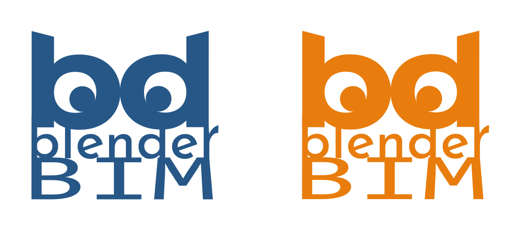
At the risk of restarting the clock. Here is an updated version that does not use the blender colors and one that adds more curves. I'll probably keep poking at it because it is fun to see if anything better pops out.
@baswein how does the logo work at smaller resolutions, such as on the blenderbim.org website, or favicons?
Doesn't work very well at 16x16


Better at 64x64
Better with darker colors
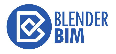
Some simplified logo ideas here:
This isn't my forte but I think they could be refined/optimized for small viewing.
@baswein can you please post your files? I want to play with them a bit
Sure @duncan! All the iterations are in this Inkscape svg. Sorry it is a mess :). Looking forward to seeing what you come up with.
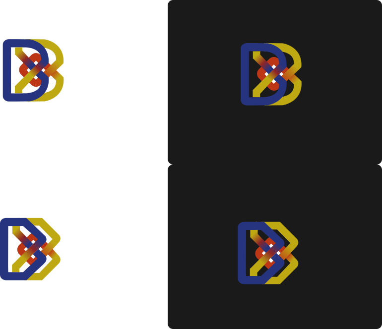
Here's some ideas I've had which built on @baswein s logo (before i got his SVG) and the OpenBIM logo

Basically I'm liking the buildingsmart reference to his logo and trying to work the openbim reference into how it could appear in longer form. It's pretty rough and messy, I'm not not very good with Inkscape.
I was playing off of the building smart logo but switching the linked chains to a flow and conversion metaphor.
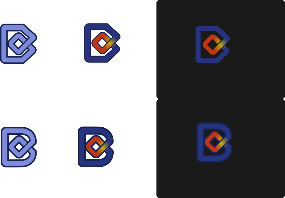
those are really cool, but also seem a bit generic to me. Does that matter? I don't know. love the text, not so sure about the snake sleeping beside a lamppost.
JAJAJAJA. it is a b, a bbbbbb... :)
Anyway... here another option with design of @baswein
@bitacovir I like your layout.

Changed the font to one that I think works a little better with logo. 2 different color schemes.
And here is a larger version
And a try at a Favicon
It is only a personal preference, but I would prefer a font with a strong character. A fancy character may work... whit same height, color and font, to blend both names and create a single word and sound: BLENDERBIM, blenderbim
You can explore more font types in this website, even writing the text to compare: https://www.fontspace.com/popular/fonts?p=18
I too have a personal preference for a font size that matches the logo height, as well as a single typeface, not two for consistency.
Hi guys,
I just wanted to add some ideais. I really liked the simplified version that @baswein posted earlier so I played a little bit with that idea. The file is attached: