

Hunt for the new OSArch.org logo

As we started a serious discussion on the https://osarch.org/ homepage (here) and so we should also get the logo design process rolling.
Let's try gathering the ideas here: https://dev.first-draft.xyz/d/K0ahv7t06h/ going in colums with concepts (lettered) and in rows with variants (numbered), please also state the autor's name and a short description where it comes from.
Tagged:
Comments
Svg files don't seem to work for me very well right now (they get squashed in a funny way) so please use a 300/300px raster or tell me how to fix it.
Hi Jan and everyone,
Hope that was an open invitation for people to contribute. I have added an abstract variation working from your suggestion. I've been reading the posts here and wanted to contribute something. Saw this as an opportunity.
Really liked the initial idea, but thought it might be nice to see a variation.
I like the way that this variation has the shapes depicting "O" and "A" for Open-source Architecture.
Geometrically, I also found it interesting that if you rotate the tetrahedron so that its plan view width matches the diameter of the sphere, that one of the vertices lines up at the intersection point of the circle.
Hope this helps progress the logo! :)
Hi @JanF I really like what you do and like your design
Some days ago here I saw a logo, I don't know from you?, which was really good for OSArch
Sorry that I wasn't so clear. Yes, as with pretty much everything in this community, everyone is encouraged to participate.
I unfortunately don't know what you mean, I haven't seen or made any other proposals yet.
@JanF this one: https://community.osarch.org/discussion/114/osarch-website-design#latest
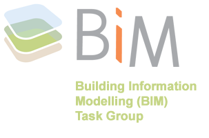
https://dev.first-draft.xyz/d/K0ahv7t06h/ is not working for me. I like the B logo used at twitter https://twitter.com/blenderbim?lang=fi why change it? If you want an icon perhaps something that shows the connection (of information) like bimloket star. Or the layered icon like the task group. An schematic building is also nice. See attachments.


Can you please be more specific on what does not work for you on first-draft? Is it the website itself? Do you not see anything? Or do you mean as a way to propose things?
This is kind of exactly why we need a logo heh, OSArch is not the same thing as BlenderBIM add-on! BlenderBIM add-on is basically just one of the open source projects this comunity is built around.
The First-Draft website was blank, but now it's working. Lol, I get it know. You can ignore my suggestions, those were focused on BlenderBIM
Ah, right, but this was just a presentation of a colour palette, not an attempt on a logo, but I admit I kind of like it graphically.
I like the way the logo is going - maybe with two colors once we hit a color scheme?
I love the shape @jamesjky ! I loved it so much I copied it and made a slight variation to "humanise" it :) Something a little sketchy to characterise a community, hacker culture, unpolished, messy, design process... etc etc.
Love the progress! Should we set an arbitrary "deadline" so this doesn't drag out, say after 2 weeks have passed with no new entries, we call a vote?
Nice! Yes, it really needed some humanising. :D 2 weeks without new entries sounds good to me!
Pinging @hzamani @bitacovir @DADA_universe @ReD_CoDE @Nilson @bruno_perdigao and @baswein who helped contribute designs for the BlenderBIM Add-on logo... who may be interested in this initiative to design an OSArch logo!
I made my contribution on the whiteboard too.
Edit: I think I dehumanized it.
I like Moult's design, but I would just add a Flower on it too. As something beautiful, refreshing and tangible as nature should also be. #NoLimits
Added my idea - it needs some humanization. It is a more traditional logo but I think the meaning is more easily interpreted.
Thanks for the heads up. Couldn't resist. Perfect excuse for a break. Had a go at it. Now back to work! ;o)
So many good idea. This is going to be so cool!
Just submitted an idea during lunch break. Hope it helps
Added some more variations of the @jamesjky theme.
You mean variations on my variation on your theme :P Very nice! The minimalist in me is trying to find a good reason for keeping it more abstract, but I think all the suggestions now are really good. Looking good, folks!
Added my contribution, based on @baswein and @chunchk ideas.
I really like the yours @bruno_perdigao, but I couldn't help myself and made a sketchy one of that as well :D I feel like Moult has a point with the rough sketch styling being closer to the nature of OSArch. Btw. not sure what it was originally, but I see it as a tree in front of a building/mountain now.
@JanF Originally I thought about using the open source logo (baswein's idea) covered by an arch shape (chunchk's idea).
I thought about making it sketchy, but I just coudn't get it right. I like yours because it looks sketchy and clean. It works in a small resolution.
Loving @bruno_perdigao logo (#K)
Maybe the O in the sketchy version need to make some adjustment?

seems very close to airbnb logo.... (ó﹏ò。)
Also saw this the other day. Think it would be important to make it unique if we are to incorporate the open-source logo.
Damn, I kind of liked that one, heh. Thanks for the heads up.
I think it would be good not to incorporate the OSI logo, because technically what we support is free software - there are apparently some open source licenses that do not respect user freedom.
Added a variation of the option J, by @JanF . I played a little with grease pencil modifiers.